| The Moving Image | |
|---|---|
| Course | Arch 200c |
| Date | 2013/11/07 |
| Learning Objectives | In this first of three workshops the final animation project will be fully outlined in terms of objectives, basic techniques, and scope. We will watch and discuss several short videos both loosely and tightly related to architectural production. We will also cover texture mapping for the site. |
| Agenda |
|
| Uses Tool(s) | |
Project Outline
Class will start with a quick discussion of the project scope, timeline, and components. See the project description for more details.
The Moving Image
Introduction to Camera Techniques
As a basis for this each animation particular attention will be paid to the relationship between specific camera techniques and the conceptual framework of the film/animation. Each person will choose two specific camera techniques from a list of seven to use in their animation.
- 1. Pan
- In pan shots the camera moves in a smooth horizontal motion from left to right, like a panorama.Always start on a still shot, begin movement, and finish on a still shot. Panning shots are great for panoramic views and scenery. Panning is also good for following a subject or to show the distance between objects.'
- 2. Tilt
- Tilt is like pan, turned 90 degrees, the camera moves up or down without raising its position. With a tilt, you can also show how high something is. When you tilt up and shoot an object it looks larger and thicker. The subject looks smaller and thinner when you tilt down. Start on a still shot, begin the tilt, and finish on a still shot.
- 3. Pedestal
- Not tilting, but physically moving the height of the camera up or down. You pedestal the camera up or down to get the height you prefer. If you want to get "eye to eye" with a six-foot-six basketball player, you would pedestal up. While shooting a flower or a small child, you would pedestal down to their level.
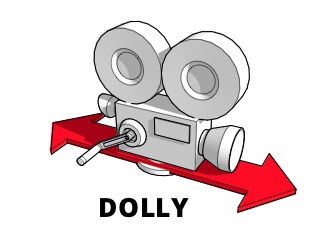
- 4 Dolly
- The camera is set on tracks or wheels and moved towards or back from a subject. Dolly is used to follow an object smoothly to get a unique perspective. A dolly does not necessarily have to follow a straight line, it could also follow a curved pathway.
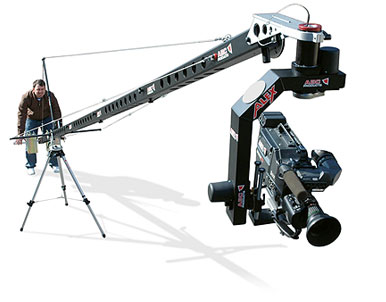
- 5. Crane
- Crane works and looks similar to a construction crane. It is used for high sweeping shots or to follow the action of your subject. It gives a bird's eye view and looks as if the camera is swooping down from above. Movie directors use this for street scenes so they can shoot from above the crowd and the traffic, and then move down to eye level.
- 6. Zoom
- On a physical camera you press a lever or rocker to zoom in or out. This lever controls the lens mechanism inside the camera and zoom speed can be controlled. Usually, the harder you press on the lever the quicker the zoom. Zoom is used to bring objects at a distance closer to the lens, or to show size and perspective. Start on a still shot, then zoom smoothly, and end your zoom on a still shot.
- 7. Rack Focus
- Focus on one object, like a building, and have everything behind it out of focus. Then adjust the focus so the building becomes blurred and the scene behind becomes clear. In this movement, you are changing the focal length so that one subject will go out of focus while the other comes into focus. The two subjects must be at a correct distance from each other and from the camera for this shot to work.
Animation Screenings + Short Discussions
Several short animation/film screenings and discussions are intended to set the stage for what is possible and help us think outside of the typical architectural fly through animation. Each discussion should address how specific camera, graphic, and lighting techniques contribute or detract from the overall theme.
- Group 1
- Royal Re-Formation by Factory Fifteen
- Local Code / Real Estates by Nicholas de Monchaux
- Wings of Desire (clip), The Accident – Wim Wenders
- Group 2
- A Series of Uncanny Events – Vidhya Pushpanathan, Student AA
- Kahn’s Exeter Short Film – The Third & The Seventh
- Citizen Kane – Orson Wells
- Group 3
- High Line Design Video – Diller Scofidio + Renfro, Video by Brooklyn Digital Foundry
- Museum Plaza – OMA, Video by Brooklyn Digital Foundry
Storyboards
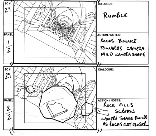
Storyboards are graphic organizers in the form of sketches or images displayed in sequence for the purpose of pre-visualizing a motion picture, animation, motion graphic or interactive media sequence. Storyboards notate camera views/moves, spatial relationships, lighting, process, etc. Each animation project should start with a rough storyboard as a way to begin to organize your ideas. The storyboards will be developed along side each animation.
Storyboard Iteration 1
- Short project statement. What relationships are you trying to show? What is your approach to site and architectural occupation?
-
5 quick sketches (frames) of key views that include
- Camera technique (it may be still)
-
Animation components - if present and in what way
- Site
- Architectural occupation
- Temproal site force
- Quick notation of what is going on
Site Texture Mapping
The Point Bonita Site is essentially a patchwork mesh. To texture map the site we will work between Vray, Texture Mapping Properties in Rhino, and Photoshop. It is important to keep in mind when working between original Photoshop textures and Texture Mapping in Rhino that you must keep a base height/width ratio that can be scaled evenly between the two programs.
- We will be working on a 80" x 40" Photoshop file at 100 dpi.
- In Rhino draw a 80" x 40" rectangle and scale it by 400/1. Place this rectangle next to the site.
- Select the site and navigate to the "UV Editor" within the properties tab. Rhino will direct you to draw a rectangle, draw one with in the rectangle you just scaled. You will see Point Bonita's several mesh surfaces flatted next to the model.
- In the main Rhino menu go to curves -> curves from objects -> mesh outline. Drag the outlines and rectangle away from the surfaces. Click Cancel in the UV Editor.
- These mesh outlines will serve as the base for photoshop work. Keep in mind which mesh outline corresponds to which part of the model.
- Make a copy of the mesh outlines and rectangle and scale them 1/400. Export these lines to Illustrator. In Illustrator place the lines in a 80" x 40" art board.
- Open the Illustrator file in Photoshop and use the lines as guides to start building up textures. You will want to start with simple layers and work back and fourth between Photoshop and Rhino so you get a good idea of how the texture is coming along.
- Leaving a bit of a buffer around the textures delete "blank" space. Delete the Illustrator line layer and save the image as a tif or jpeg.
- In the Material Editor of Vray create a new "Standard" material. Upload your new jpg file as the TexBitmap and apply it to the site.
- Draw a 80" x 40" rectangle and scale it up 400%.
- Go back into the UV Editor. When prompted to draw a rectangle draw it to the same size as the rectangle you just scaled.
- Click on the folder icon in the UV Editor and load the same jpg file you used for the texture. This may take a minute.
- Zoom in and move the flat mesh pieces into place. they should not be too far off. Click Apply.
- You will notice that some of the texture gets stretched in odd ways because of the nature of the site. This is something you will have to account for when making the photoshop file.
- Another option is to create a completely textured 80" x 40" Photoshop file and use the "Box Mapping".
- More detail on Texture Mapping


