|
Precision & Composition Basics in Illustrator |
|
|---|---|
| Screenshot | |
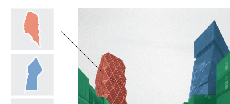
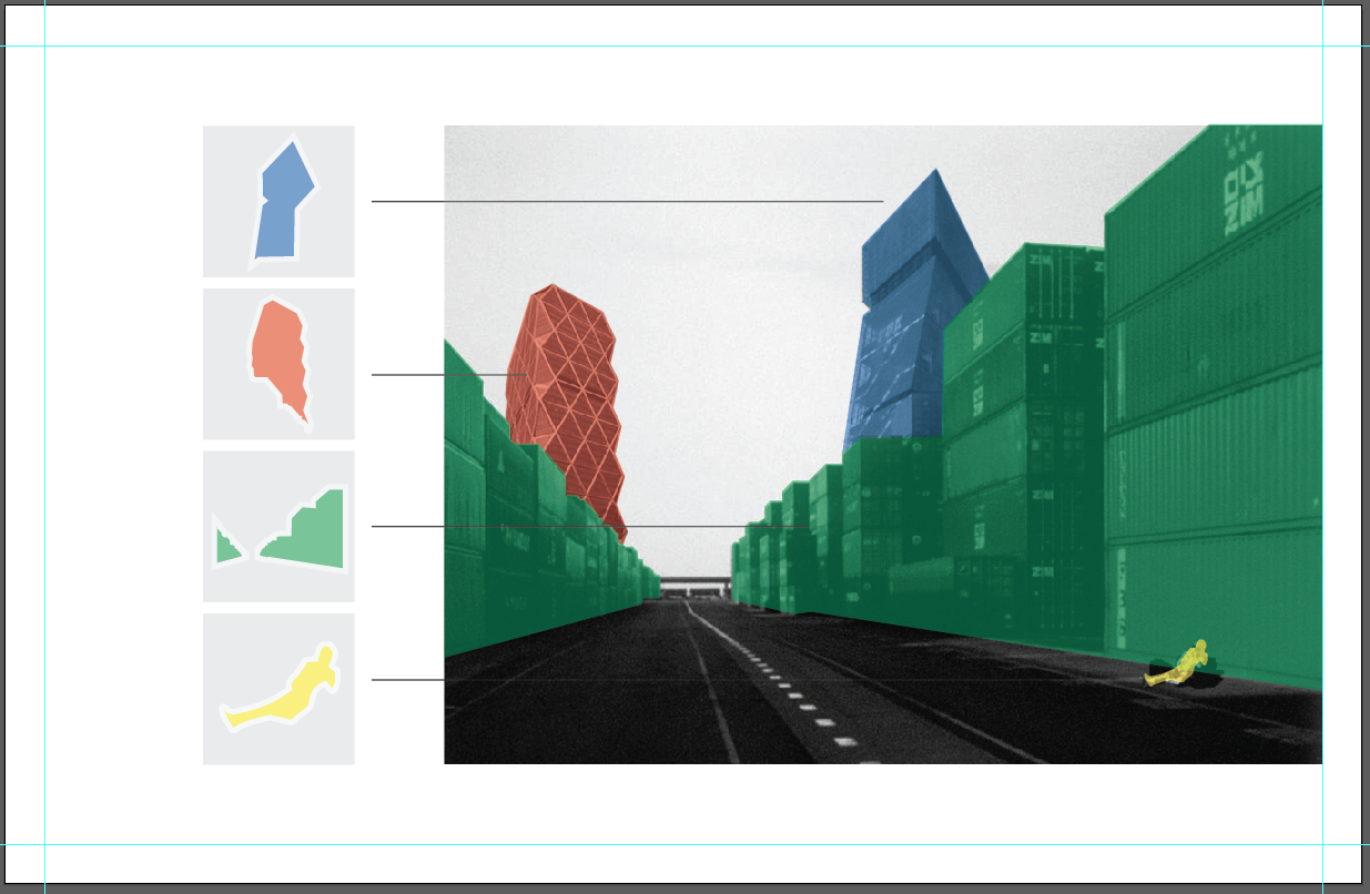
| This workflow teaches Illustrator as a vector based tool for efficient layout composition, digital drawing, and photo layering effects. Rulers, alignment tools, text editing, drawing, and layer management are emphasized. Students will learn an efficient process in composing a diagram that visually describes the constituent elements that compose a single image. The tools used within this workflow can be used throughout the design process; from concept development through presentation boards. | |
| Uses Tool(s) | Illustrator CS5 |
Steps
Setting Up a Working Illustrator Document
To begin this workflow we will establish basic practices in setting up a productive Illustrator document to work within.
The first step after opening Illustrator is to create a NEW document. This is easily done by selecting "File > New" from the top menu bar or pressing COMMAND / CONTROL + the N KEY. Here we will see a dialog box appear. Create a Horizontally oriented 11 x 17 document.
- New Document Dialog Box
Now that we have our new 11 x 17 document we will want to begin to consider how we will compose its eventual content. A general technique for layout composition is to work from the outside in, or rather from the margins. Is is useful to decide if you would like your composition to be "full bleed" or if you would like to have well defined margins away from the document's edges.
For this exercise we are going to define symmetrical margins. To do so, open RULERS by either selecting "View > Rulers > Show Rulers" from the top menu bar, or simply pressing COMMAND / CONTROL + the R KEY.
Rulers will appear horizontally along the top margin and vertically along the left margin of your document window.
By moving your cursor atop the rulers and clicking, you can drag GUIDES onto your document.
For the sake of this workflow, lets set 1/2" margins on all sides of our document using the RULER GUIDES.
- Guides - 1/2" Margins
While it appears that we have set our GUIDES appropriately, with further inspection it turns out that our 1/2" setting is not precise. This is identified through zooming in with the MAGNIFYING GLASS TOOL, selected from the main tool bar or simply pressing the Z KEY. We can also zoom in / out by holding the OPTION KEY and using the mouse scroll, or holding COMMAND / CONTROL and pressing the + (PLUS) or - (MINUS) KEYS.
- Imprecise Guides
To correct our GUIDES and place them at a precise 1/2" distance from our document's edge, select the leftmost vertical GUIDE and notice the tool option bar directly above your document change. You will see X and Y coordinates indicated. These coordinates are our REFERENCE POINTS. For our vertical guides we will be paying attention to the X REFERENCE POINT.
- X Reference Point
You will see that the X REFERENCE POINT is not quite 1/2". Mine is at distance of .4929" away from the edge. We can quickly snap our GUIDES to the 1/2" distance by typing .5 into X selection box.
Repeat this step for the remaining three GUIDES. And remember to alter the Y selection box for your horizontal GUIDES.
- Corrected Guides
The last thing to consider before we create content within our document is to establish how we are going to organize it. Take note of your LAYERS panel. Select "Window > Layers" from the top menu bar, press F7, or press the layers button on the right tool bar.
- Layers Panel
Select the arrow to the left of LAYER 1 and view its contents. Notice that there are four sublayers each titled <Guide>. In order to keep organized and work efficiently as we inevitably introduce more content into our document, simply DOUBLE CLICK LAYER 1 and rename it "Guides".
LOCK the layer by selecting the box directly to the left. A LOCK icon will appear. Note: GUIDES can be LOCKED without locking LAYERS by selecting "View > Guides > Lock Guides".
- Guides Layer
Introducing Content
Now we are ready to bring in content to compose within our organized document.
From the top menu bar, select "File > Place" and select the Workflow-3.jpg file from Dropbox. After the image is placed, resize it to be 8" in HEIGHT. You can do this by manually typing the number 8 into the selection box titled H directly above the document window. Make sure to select the LINK button in-between the H (HEIGHT) and the W (WIDTH) boxes to keep the image's dimensions proportionate.
- Modifying Dimensions + Link Button
Now in order to center and right-justify the image drag it and notice a green SMART GUIDE that will indicate when the center of the image aligns with the center of your document. The images will also snap against the right vertical GUIDE when dragged close to it.
You can confirm the accuracy of the placement of the image by viewing the Y REFERENCE POINT. It should read 5.5. This indicates that the horizontal center of the placed image is positioned at 5.5" along the Y axis, or in other words, in the direct center of your 11" high document.
Finally, we need to bring our recently placed image into a new layer. To do so, within the LAYERS PANEL, select the CREATE NEW LAYER icon from the bottom bar.
It will be automatically titled LAYER 2. Change the title to "Base image" and then click on the placed image. You will notice a blue bounding box surrounding it as well as a small blue square on the far right of the "Guides" layer.
DRAG the blue square into your new "Base image" layer. The blue square and bounding box will suddenly change to red. This indicates that the object (in this case, the placed image) has been moved into a new layer. It is important to note that each subsequently created layer will be associated with a new color.
- New Layers + Moving Across Layers
Drawing
Now we are going to trace the constituent elements of the placed image.
First, create a new layer titled Hearst Tower and make sure that you are operating within it. This is indicated by it being highlighted differently from the other layers.
Next, select the PEN TOOL by either pressing the P KEY or selecting the pen icon from the main left tool bar. Zoom into the Hearst Tower portion of the image and being to trace it through clicking along its perimeter. You will notice that the PEN TOOL functions similarly to the Polygonal Lasso Tool in Photoshop. Remember that you can pan throughout the document while you trace by holding the space bar down and dragging.
- Tracing
After you have completely traced the visible portion of the Hearst Tower open the COLOR PANEL. You can do this by either selecting the top right button from the right main toolbar, pressing F6, or selecting "Window > Color" from the top menu bar.
Within the COLOR PANEL you can use an EYEDROPPER TOOL to select a specific color from the color spectrum. In the case of the Hearst Tower Layer, select red and carefully adjust it within the CMYK selection fields. Select C: 0%, M: 100%, Y: 100%, and K: 0%. This will give us a pure red.
Also, take note of the overlapping square and hollow square icons in the top right corner of the COLOR PANEL. The full square indicates the FILL, the hollow square indicates the STROKE. For this exercise we are going to fill the Hearst Tower with red.
- Color Panel
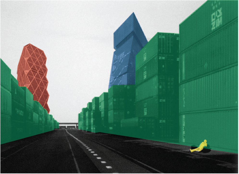
Now repeat for the De Young Tower, the Containers, and the Traveler. Use the following color values for each constituent and make sure to compartmentalize them into their discrete layers:
De Young Tower: C: 100%, M: 50%, Y: 0%, K: 0%
Containers: C: 100%, M: 0%, Y: 100%, K: 0%
Traveler (top layer): C: 0%, M: 0%, Y: 100%, K: 0%
- Color Layers
Transparency
Tracing over the image has created an abstract composition of shapes. For this exercise we are aiming to describe the relationship of the constituent elements in more of a literal sense. In order to do so, we need to be able to read the information beneath the tracings.
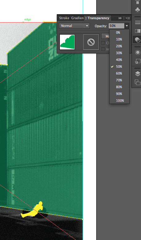
Select the TRANSPARENCY PANEL from the eclipse-like icon from the right toolbar. You can also select "Window > Transparency".
Select the object that you wish to modify and use the OPACITY drop down menu to adjust its transparency level. You can also manually type a value. Note: You can always modify an entire layer at once by clicking its respective small circular icon to the far right within the LAYERS PANEL.
- Opacity within Transparency Panel
Adjust the layers as follows:
Hearst Tower: 50%
De Young: 50%
Containers: 50%
Traveler: 65%
- Transparency Adjustment
Creating, Coloring & Aligning Shapes
In an effort to further describe our constituent elements as independent and equally valuable entities within our composition we will create icons of them. In order to do so we need to scale them into a shared set of dimensions.
First, create a new layer and title it "Squares".
Now, and with the "Squares" layer selected, select the RECTANGLE TOOL by either pressing the M KEY or selecting the rectangular shaped icon button from the left main toolbar.
Now, through holding the SHIFT KEY and dragging, we can create a square.
From the options menu above the document window modify the W (WIDTH) and H (HEIGHT) REFERENCE POINTS creating a 2" x 2" square.
- 2 x 2 Square
Select the EYEDROPPER TOOL by either pressing the I KEY or selecting the eyedropper icon button from the left main toolbar.
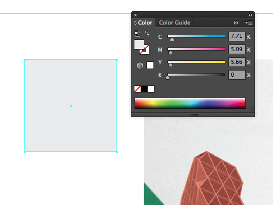
With the square selected, use the EYEDROPPER to select the light grey sky from the placed image.
Notice in the COLOR PANEL how the FILL or STROKE (depending on what was preselected) has changed to the approximate color of the sky. The EYEDROPPER selects FILL and STROKE values including color, line weight, ,line type, transparency, gradient, etc.
Make sure that the FILL of the 2" x 2" square is the grey color of the sky.
- Sky Colored Square
Now copy the square (CONTROL / COMMAND + C KEY) and paste three times (CONTROL / COMMAND + V KEY). This will give you a total of four grey squares.
Select them all either by using the SELECTION TOOL (V KEY) or by selecting the "Squares" layer.
Open the ALIGN PANEL ("Window > Align" or SHIFT + F7). Under the ALIGN OBJECTS field select HORIZONTAL ALIGN LEFT.
- Horizontal Align Left
Within the ALIGN PANEL (and with the "Squares" layer still selected) in the DISTRIBUTE SPACING field, ALIGN TO KEY OBJECT, type .15 in the SPACING OPTIONS BOX, and select VERTICAL DISTRIBUTE SPACING.
- Vertically Distributing Spacing
With them selected, press (CONTROL / COMMAND + G KEY) or select "Object > Group" from the top menu bar. Now they are only editable as a single unit.
Within the options field above the document window in REFERENCE POINT H type in 8" and make sure that the LINK button is selected. This will scale the group of square to the height of the placed image.
Manually drag the square group to align with the lefthand side of the placed image. Leave a little room between the two.
- Aligning the Layers
Creating Icons
Now we are going to extract the shapes of the constituents that we traced and filled in order to create icons within a legend.
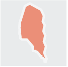
Starting with the Hearst Tower, copy (COMMAND / CONTROL C) and paste (COMMAND / CONTROL P) it, and them drag it to sit atop the topmost grey square. There is a problem. It is sitting beneath the square!
- Layer Adjustment Needed
To correct, manually drag the "Squares" layer beneath the "Hearst Tower" layer.
Now, with the copy of the Hearst Tower still selected, manually scale it by using the control points of the found along the corners of the its bounding box. Remember to use the SHIFT KEY in order to keep it proportionately scaled.
Scale it to fit into the topmost grey square.
To give the newly shrunken Hearst Tower a more iconographic presence we will need to give it a border. Within the COLOR PANEL, and with the STROKE (hollow square) icon in the foreground, use the hand icon to select white (simply hover over the white box).
A white border, or STROKE, has been added. However, it is barely noticeable.
Within the STROKE PANEL (the horizontal lines icon within the right main toolbar or "Window > Stroke") from the WEIGHT drop down menu select 5 pt.
This will beef up the line weight and create a conspicuous edge for our Hearst Tower Icon.
- 5 pt Edge
Continue with the three remaining constituents in top down order:
1) Hearst Tower
2) De Young
3) Containers
4) Traveler
- Icons
Annotations
Next, to strengthen the visual connection between the icons and the original image we are going to create annotation lines.
Create a NEW LAYER and name it "Annotations". Next, press the \ KEY or select the horizontal line icon button from the left main tool bar.
Starting just to the right of the Hearst Tower Icon, click and drag while hold the SHIFT KEY. As you drag you will notice that the line only moves at 90 degree and 45 degree angles.
If we create a straight line from the Hearst Tower Icon to its origin within. the placed image there is a problem. The line obstructs a path from the De Young Icon to the De Young within the placed image.
- Clarifying the Diagram
To correct, through manually dragging them, switch the placement of the Hearst Tower and the De Young Tower.
Now draw a horizontal line that connects the De Young Icon to the original De Young image. Continue with the same process for the remaining three constituents.
- Annotation Lines
Open the ALIGN PANEL ("Window > Align") and select HORIZONTAL ALIGN LEFT.
Select the square group and UNGROUP ("Object > Ungroup", or SHIFT + COMMAND / CONTROL + G KEY).
Now, select both the grey square below the Hearst Tower and its adjacent line (hold the SHIFT KEY while you click on them individually). Within the ALIGN PANEL select ALIGN TO KEY OBJECT and select the square. Click on the VERTICAL ALIGN CENTER button within the DISTRIBUTE SPACING field. This will align the annotation line with the square (while preventing the square from changing position).
- Aligning Annotation Lines
Adjusting Annotation Line Properties
Now that our annotation lines are aligned we need to make them more legible.
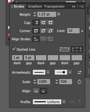
With the annotation lines selected, open the STROKE PANEL and change the line weight to 1.25 pt. Next, check the DASHED LINE box and experiment with the DASH and GAP values. For this exercise, a DASH value of 1 and a GAP value of 3 should suffice.
Unfortunately we have run into a problem. Some of our lines are not visible because of their tonal similarities with the background.
- Annotation Line Invisible
Through considering the overall design of our layout perhaps we can come up with a solution. The obvious decision is to change the line color. But there may be a more elegant one...
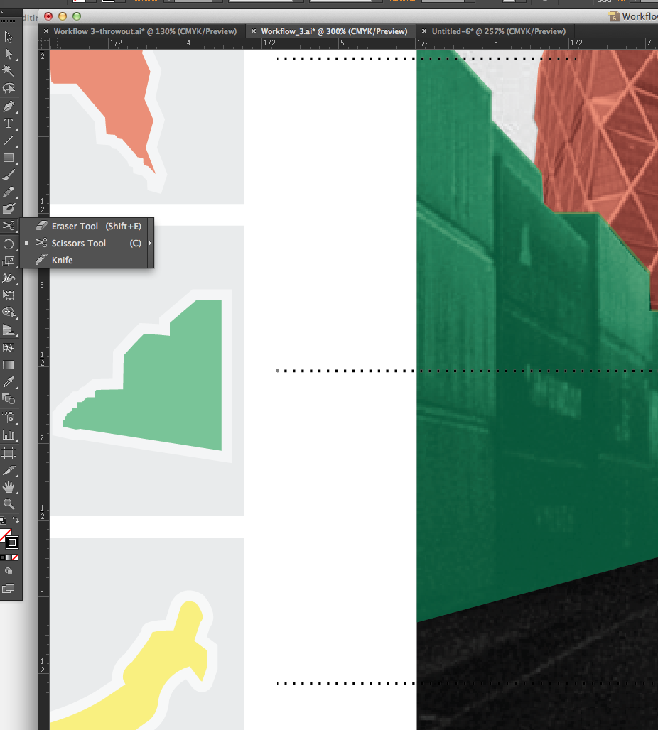
Select and zoom in to the line for the Containers Icon. Select the SCISSOR TOOL (hold down the eraser icon button and select the scissor icon within the left main toolbar or press the C KEY).
- Scissors Tool
Click on the line where you want to ultimately make it more legible. Notice how the SCISSOR TOOL is trying to select points from objects other than the line you are aiming to alter. Resolve this by locking all layers except the "Annotation" layer.
The SCISSOR TOOL will divide the line into fragments based on where along the line you have selected. Think of it as a tool that sets points as dividers along lines.
Once the lines are divided, select the fragments that need to be adjusted and change their STROKE to white. Now the lines are legible.
For the finishing touch, select the line fragments that are closest to the original constituents within the image (select the De Young's entire line). Within the STROKE PANEL select the far right ARROWHEAD drop down menu. Arrow 21 is a good clean choice. Now with the SCALE box directly below experiment with the size of the arrowhead. 50% looks pretty clear and elegant here.
- Arrowheads
Text
Another descriptive element within our composition is text.
To include text select the T icon button from the left main toolbar or press the T KEY. In the TYPE options above you will see font, size, and paragraph adjustment options.
- Type Tool
For more options including kerning, leading, and tracking, press COMMAND / CONTROL + the T KEY to open the TYPE PANEL.
- Type Panel
To type, click onto the surface of the document and begin typing. In the case of this exercise, type "De Young" and press the ESC KEY when finished. Now we can move the body of type to the desired location.
After separately typing the names of the remaining constituents begin to organize them next to their respective icons.
Using the operations from the annotation section earlier, justify the text and align each name to the center of their respective icons.
- Final Composition


