|
Composing an Axonometric Drawing with Rhino 5, Photoshop & Illustrator |
|
|---|---|
| Screenshot | |
| This workflow explores methods of composing an exploded axonometric rendering. The working process between Rhino, Photoshop and Illustrator is emphasized; along with precision, layer organization, and composition. | |
| Uses Tool(s) | Rhinoceros for OSX , Photoshop CS5 , Illustrator CS5 |
Steps
For this workflow we will be using this file .
Setting up the Axon Viewport
When working in Rhino, you will notice that there are four visible viewports. When can easily change the vantage point of a particular viewport by RIGHT CLICKING on its title (top lefthand corner), selecting "Set View," and selecting another of the listed views.
Within this drop down menu, we can also select "Named Views...". This gives us the option to create and save new views that can be repeatedly used, as well as IMPORT them into other working Rhino documents.
For this workflow, we will be using this file. Within it, you will find an AXON view already created.
To begin, open the PERSPECTIVE viewport and SET VIEW to AXON.
- Axon Viewport
To bring the object that we will be working on into closer view, type ZE , for "Zoom Extents", and use your RIGHT CLICK + SHIFT KEY to pan throughout the viewport. Note: If you accidentally rotate your view by not holding SHIFT, return to the AXON view through following the steps mentioned above.
Exploding the Object
For the hexagonal seating module that we will be working on, we will be exploding its features vertically.
First, create a new layer named "Construction" and (within this layer) from the bottom corner of the module, draw a Vertical Line that far exceeds the height of the module.
- Vertical Construction Line
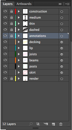
Notice within the LAYER PANEL that there are 6 layers of components that we will be identifying through our exploded axon. In order to consistently space them from one another, Divide the vertical construction line into 6 SEGMENTS. Remember: We can always lengthen or shorten the distances between segments with the Scale1d command.
- Divided Construction Line
Starting with the top layer, in this case, the "decking" sublayer, Copy its OBJECTS (from their collective bottommost point) to the height of the top POINT along the vertical construction line. Remember to select V ertical when inside of the Copy command. Otherwise the copied objects will snap to the points on the line rather than simply move to their respective heights. Continue this process for the remaining layers. See image below:
- Objects Positioned Vertically (along heights of construction line points)
Saving a New View
Now that we have the extents of our composition defined, lets save a view that we can continue to refer back to.
Within the "Set View" menu, go to "Named Views..." as SAVE AS "Axon Exploded."
Now we can continually refer back to this exact vantage point for future editing.
Make 2d
Deactivate the "Construction" layer and within the "Axon Exploded" view, Make2D . Make sure NOT to have "Hidden Lines" selected.
After the Make2D command has been completed, make sure to move the new linework away from the origin.
Next, from the "Axon Exploded" view, Make2D again. This time make sure to have the "Hidden Lines" option selected. Again, move the new linework away from the origin and next to the linework from the first Make2D .
- Make 2D Twice
We are only going to use the entire module's linework from the second (with hidden lines) Make2D and DELETE the rest. Also, place a Point on the bottommost lefthand corner of the module's linework from the first Make2D . Next, DELETE its linework.
- Point + Deletions
From its bottommost lefthand corner Move the second module's linework (with hidden lines) to the POINT.
- Moved and Aligned
DELETE the POINT and Purge unneeded layers.
Editing Linework & Layers for Postprocessing
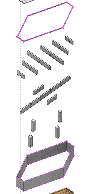
Later, within Illustrator, we are going to be FILLING the exploded components with color. In order to do so, we will need to define their perimeters with CLOSED CURVES. Using the Split and Join commands, create closed curves for the objects' edges. See example below:
- Defining the Objects' Edges as Closed Curves
- Detail
It is useful to also, add construction lines that can be represented as dashed lines in Illustrator
- Construction Lines
Finally, create new LAYERS for separate lineweights & line types. For the module axon, create and assign layers for "thin", "medium", and "dashed" lines.
- New Layers
Scaling the Axon
Now, because an axonometric is a scalable, and therefore, measurable drawing, we need to scale it to its actual dimensions.
Using the Distance command measure the shortest and nearest edge of the 3d model of the module.
It measures 11.86 inches.
Now, in TOP view and working on the linework of the axon, we are going to draw a 11.86" Line from one side of the edge that we measured in the 3d model.
- New Construction Line for Scaling
Now, Rotate the line to align with the direction of the measured edge. USE YOUR OSNAPS.
Next, Scale all of the linework using the line as a reference. Note: Make sure to DESELECT the reference line before scaling. You can do this by using the CONTROL KEY.
- Axon Scaled
Delete the reference line.
Export Linework
Select the axon linework and Export it at a desired scale and as an Illustrator file. Note: Make sure to Move your linework close to the origin before exporting.
Quick Light Rendering
Back in the "Axon Exploded" viewport, reset the view, or "Set View", to "Axon Exploded."
Select the "Render" tap underneath the command line. Here we will find our options for rendering within Rhino 5.
- Render Options
First, we need to determine a light source for the rendering of the module. Because we are focussing on an axon, and not a perspective, it is best to use a diffuse light source. If we were rendering a perspective, it may be useful to use a strong direct light source to more convincingly create the illusion of our model existing within a photorealistic environment.
Create a NEW LAYER and title it "Light Source." We will be working within this layer. Now, select the "Rectangular Light" button. It is the orange colored rectangle along the top menu bar.
In TOP view draw a rectangle that far exceeds the extents of the model.
- Rectangular Light - Top View
Back within the "Axon Exploded" viewport you will notice that the "Rectangular Light" rectangle just drawn has an arrow pointing downward. This is the direction that the light will project to.
- Light Direction
Move the rectangle above the model and experiment in other viewports with the its rotation. This will offer different shadow angles to appear.
For our rendering of the module, move and rotate the rectangular light source so it projects from the top and side of the model.
NOTE: There are plenty of other light sources to experiment with. All of them are neighbors with the "Rectangular Light" icon found within the top toolbar.
- Rectangular Light Moved & Rotated
Now that we have determined a light source, we will need to decide on its intensity. Select the light source, and within the Properties panel select the "light" icon. Here we can use sliders to adjust the INTENSITY of the light source as well as the shadow casting intensity.
For the sake of this workflow, move the INTENSITY value to 40.
- Light Intensity
Now, in order to have a surface to cast shadows onto, we need a ground plane. Type, GroundPlane and within the ground plane options window, make sure that it is selected "On" and increase the REFLECTIVITY to 40%. By adding reflectivity to the ground plane we are lightening it. NOTE: If we were working on a more photorealistic perspective we would treat the ground plane differently.
- Ground Plane Adjustment
Now, we can preview our rendering. Simply select the blue unfocussed sphere icon from the top toolbar. A preview window will pop up where we can modulate the exposure values.
- Preview Window
Now we need to set our resolution values. Select "Render settings" the from the top toolbar, it is the blue sphere + hand icon. Experiment with the Resolution, size, and DPI. For this rendering we will be using a "Custom" resolution and size. "Lock Viewport" when determining the resolution and select "Skylight" for added diffuse light.
- Render Settings
Once, you have determined your resolution settings select the RENDER button. It is the blue sphere on the far left of the top toolbar.
Save the rendering when completed.
Photo Editing
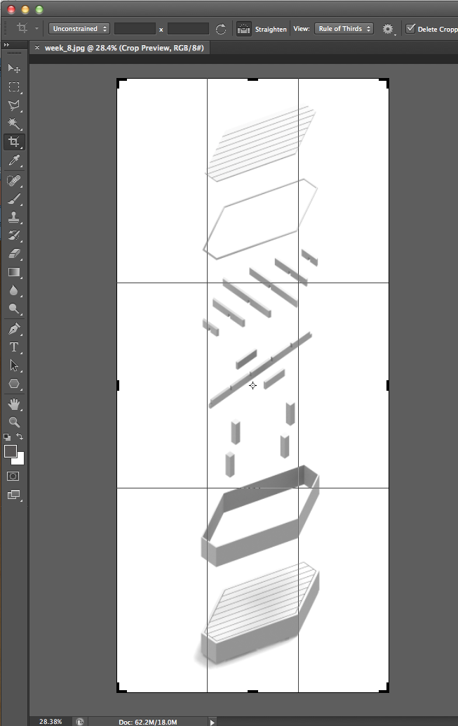
Now, within Photoshop, open the your Rhino rendering and crop any unneeded surrounding area.
- Cropping Image
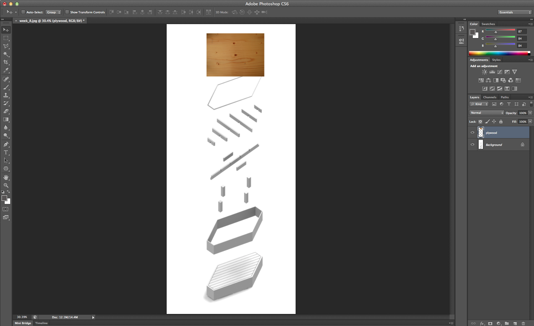
From the top drop down menu "File > Place..." an image of wood texture. The texture that is being used for this workflow was found through a simple Google image search. Here is the image .
After placing the image, right click on its layer within the LAYERS PANEL and select "Rasterize Layer."
Position the new wood texture on top of the exploded decking portion of the rendering.
- Placed Wood Texture
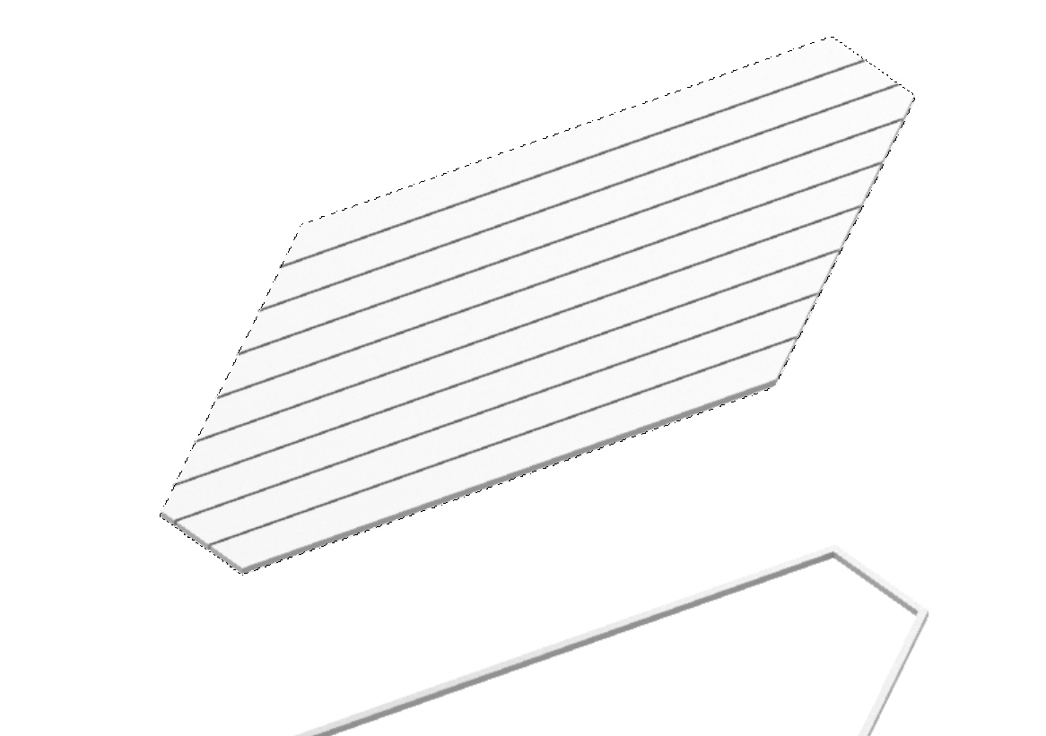
Deactivate the wood texture layer and using the POLYGON LASSO TOOL, trace the outline of the decking.
- Decking Traced
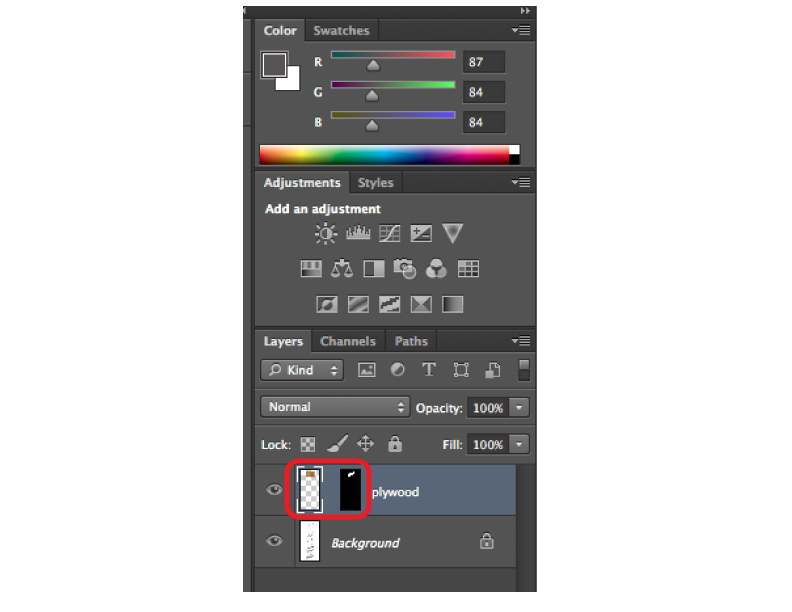
Activate the wood texture layer and select the "Add Vector Mask" button from the bottom of the LAYERS PANEL.
- Add Vector Mask Button
You will notice that the wood texture layer has conformed to the shape of the decking. To manipulate the textures properties within the margins of the decking shape, unlink the vector mask and select the thumbnail of the original wood texture layer.
- Unlinking Vector Mask
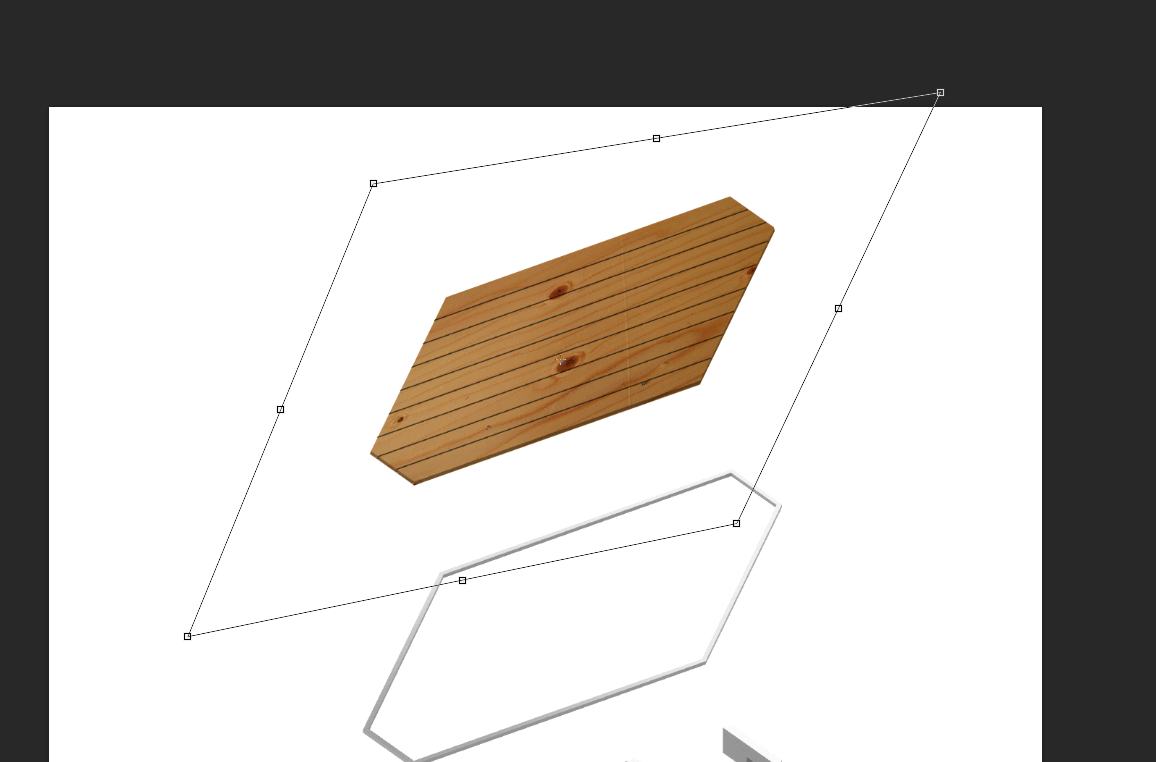
Now, either reduce the layer's opacity or select a filter so the decking is visible through the wood texture. "Edit > Transform > Rotate" and "Distort" the shape of the wood texture.
- Rotated & Distorted
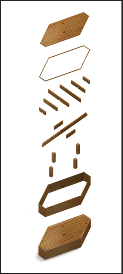
Continue the process for the remaining module components. Remember, you may need to create multiple maskings for single objects because of the differences in wood grain direction. When you have completed the process, your rendering should look something like this:
- Material Added
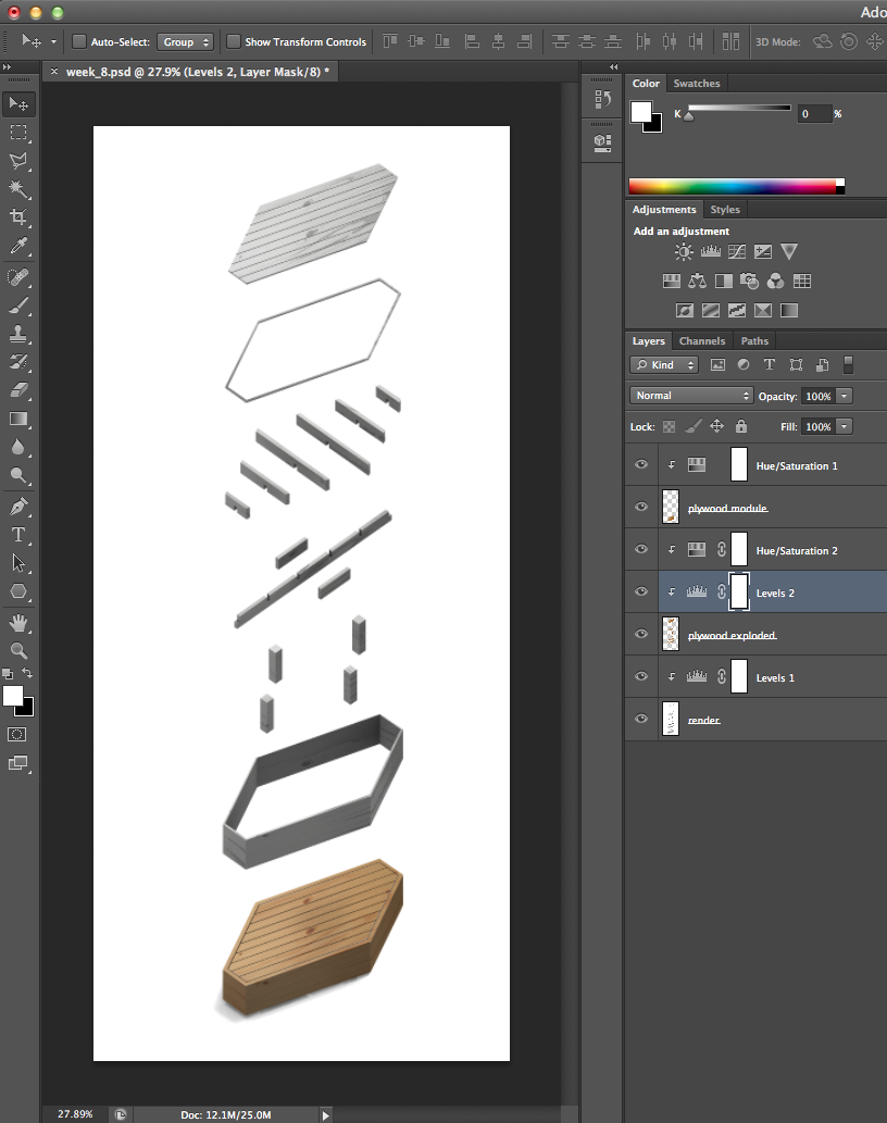
MERGE LAYERS (selected from the top right button in the LAYERS PANEL) into three distinct layers: Plywood Exploded, Plywood Module, and Base Render.
Adjust HUE/SATURATION and LEVELS in order to better blend the wood texture into the base render image. For the Plywood Exploded layer, DESATURATE for better color control in subsequent steps in Illustrator. Make sure to apply any adjustments to ONLY the intended layers.
- Layers and Layer Adjustments
Once adjusted, "File > Save for Web..." as a .jpeg for editing in Illustrator.
Describing Components
Within Illustrator, open the .ai file of the axon that was exported from Rhino. Lock all layers, create a new layer, move the new layer beneath all other layers within the LAYERS PANEL, and "File > Place" the recently saved .jpeg of the rendering. Manually scale the rendering to fit snuggly within the margins of the axon linework. Remember to hold the SHIFT KEY while scaling in order to preserve the images original proportions.
- Placed and Scaled Rendering
Now, working within the LAYERS PANEL, change all of the stroke colors to black. Perform the following for the four layers:
• Construction - move the layer to the top, change the lineweight to .5pt and dash it.
• Medium - change the lineweight to .5pt.
• Thin - change the lineweight to .25pt.
• Dashed - move the layer to the bottom of the linework layers (not beneath the render image layer), change the lineweight to .125pt and dash.
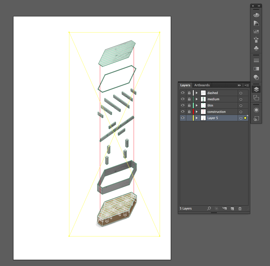
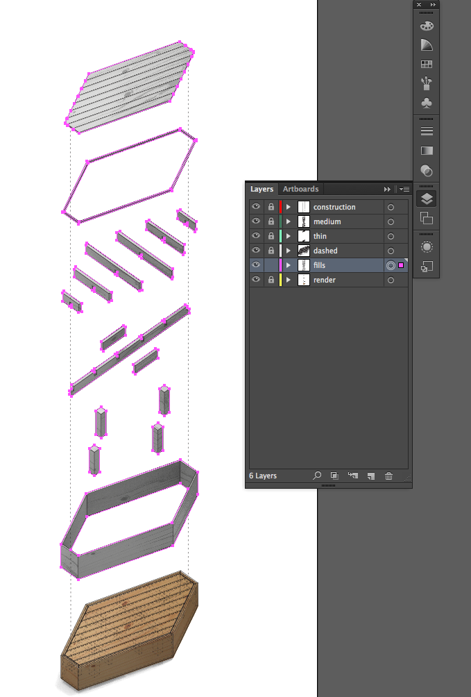
After changing the layers to their respective line properties, manually copy and paste the outlined "closed curves" that we previously drew in Rhino. Make sure when pasting to bring them into a new layer. Call this layer "fills" and move it underneath all linework layers.
- Fills Layer
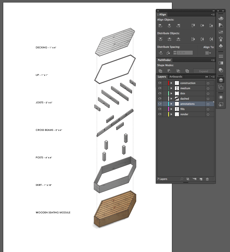
Now, we are going to assign different fill colors for every component. However, before we do so, it will be wise to use the TYPE TOOL in order to verbally describe each component. Use the ALIGN PANEL and remember to create a new layer for annotations.
- New Sublayers and Annotations
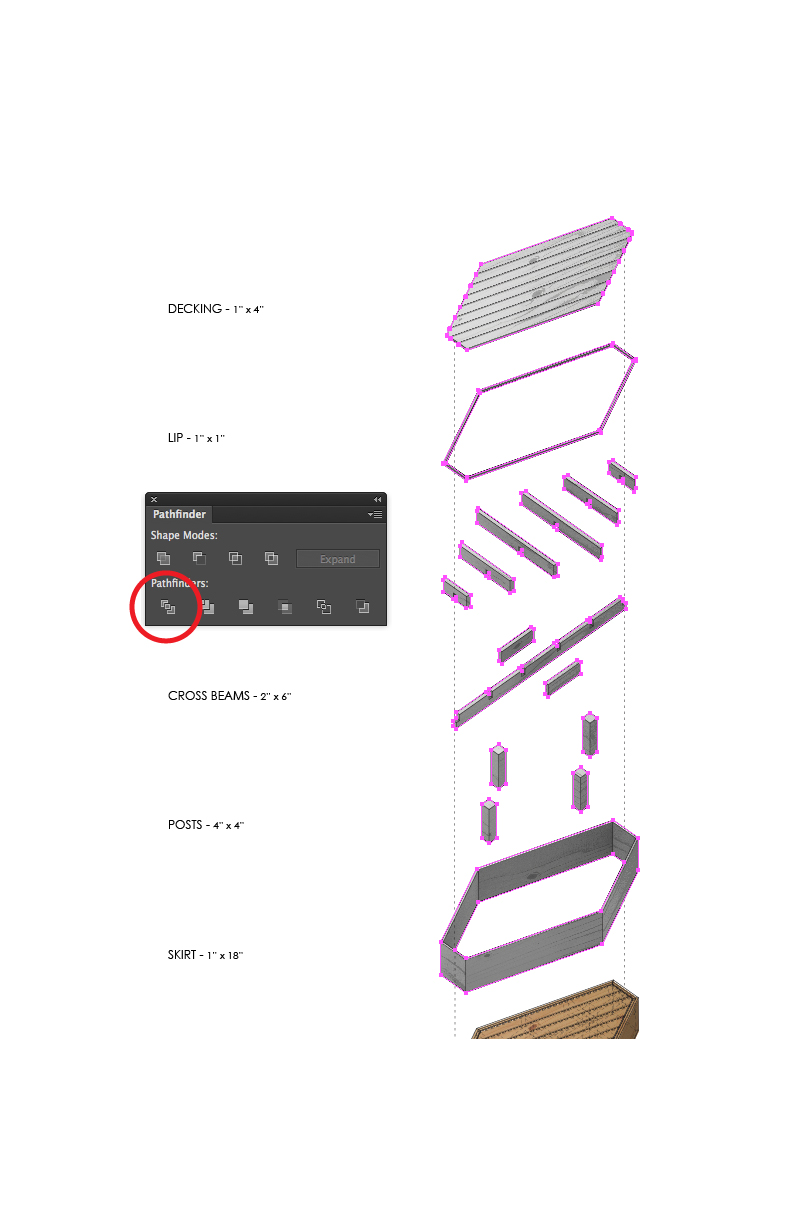
Now, select all objects within the "fills" layer and open the "Window > Pathfinder" panel from the top drop down menu.
Select the "Divide" option. Next, UNGROUP the divided lines. This is easily done by press the SHIFT + CONTROL / COMMAND + G KEYS, or selecting "Object > Ungroup" from the top drop down menu.
- Pathfinder Divide
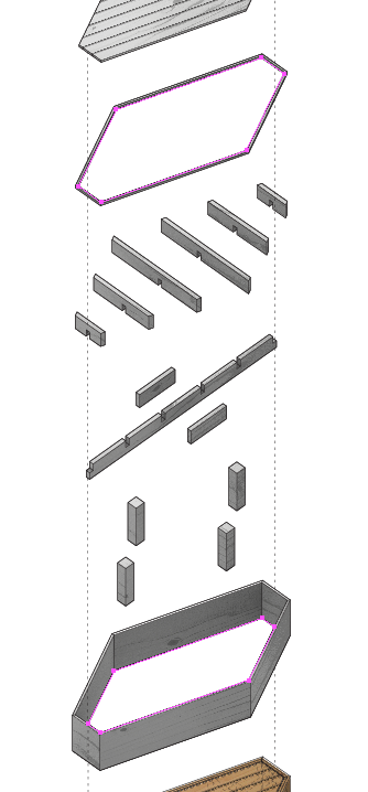
After ungrouping, delete the interior pieces from the "skirt" component and the "lip" component.
- Interior Segments Deleted
Notice that now we have donut shapes within our "skirt" and "lip" components. These can now easily be FILLED.
- Donuts Ready for Filling
In order to keep organized, create NEW LAYERS for every FILL. This will help if we need to adjust color and opacity continually within the next, and final step.
- Layer Management
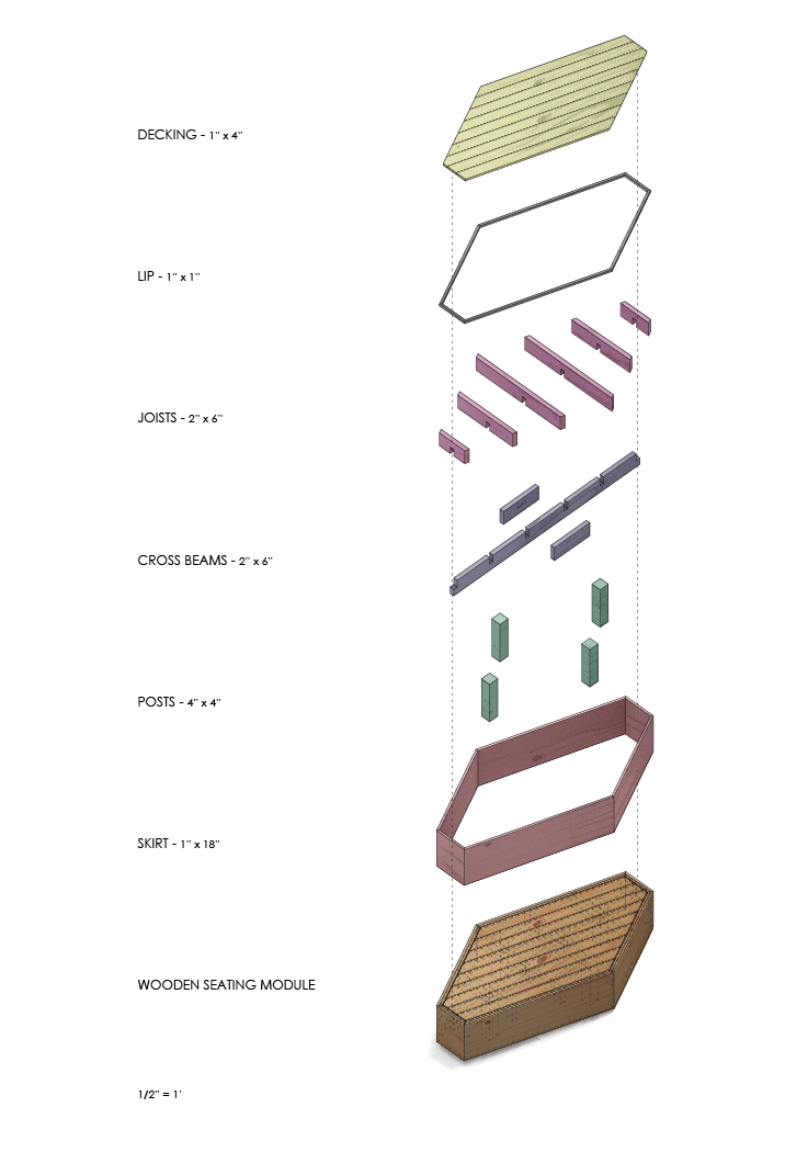
For the final step, FILL each component with a color of your choosing. Make sure to adjust the opacity in order to allow the texture found within the render layer to show through.
- Final Image
Revisions
After working through generating this diagram we can see that there is still room for clarification. The hidden lines that were originally intended to describe how the components fit together were not sufficiently clear.
Using the steps described above, we can refine our drawing and in an effort to further clarify the design.
- Refined Drawing


