|
Entourage in Perspective |
|
|---|---|
| Screenshot | |
| For this exercise, we will discuss the importance of using entourage in perspective architectural renderings. We’ll focus on how to interpret the relationships of space into the drawing’s entourage according to the horizon line in perspective, the methods used to obtain rendered perspective drawings, and the tools in Photoshop necessary to complete them. | |
| Uses Tool(s) | Photoshop CS5 |
Methods Covered in this Workflow:
- Importance of using quality entourage
- Various Photoshop tools (clone stamp, brushes, texture overlay)
- Textures/materials - tileable textures, importance of scale and depth
- Shadows - connection to light source
- Plants - applicable plants
- People - scale, perspective, function, and personality
Entourage in Perspective
Using architectural entourage is the expression of a spatial idea upon a drawing. The composition of all parts of the drawing determine how one reads the scale, light, space, and texture of building and depicts spatial ideas regarding human interaction with both the building and its site. Where simply rendering the material and texture qualities of a building provide information pertaining to construction quality, incorporating the appropriate entourage will display spatial programmatic elements.
As architects, we use entourage – here defined as the surroundings of a building, or the parts of a drawing beyond purely architectural information, i.e., people, animals, plants, textures, shadow, and light – to tell the viewer what that space may be like when inhabited.
Steps
Import Into Photoshop
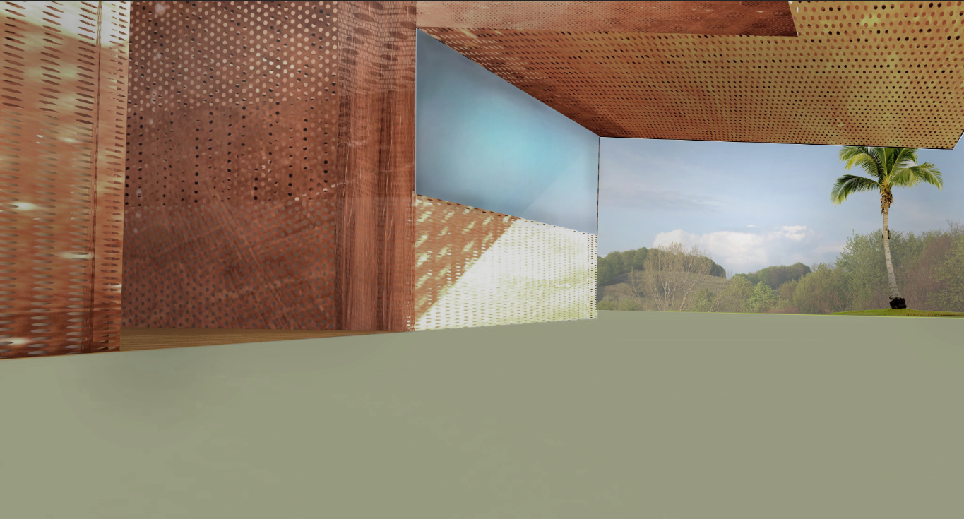
Open your created rendered perspective image in Photoshop. Note: If any part of the drawing opens with a checkered background - this is meant to signify that the layer has portions that have no pixels defined and are transparent.
Noting the Horizon Line
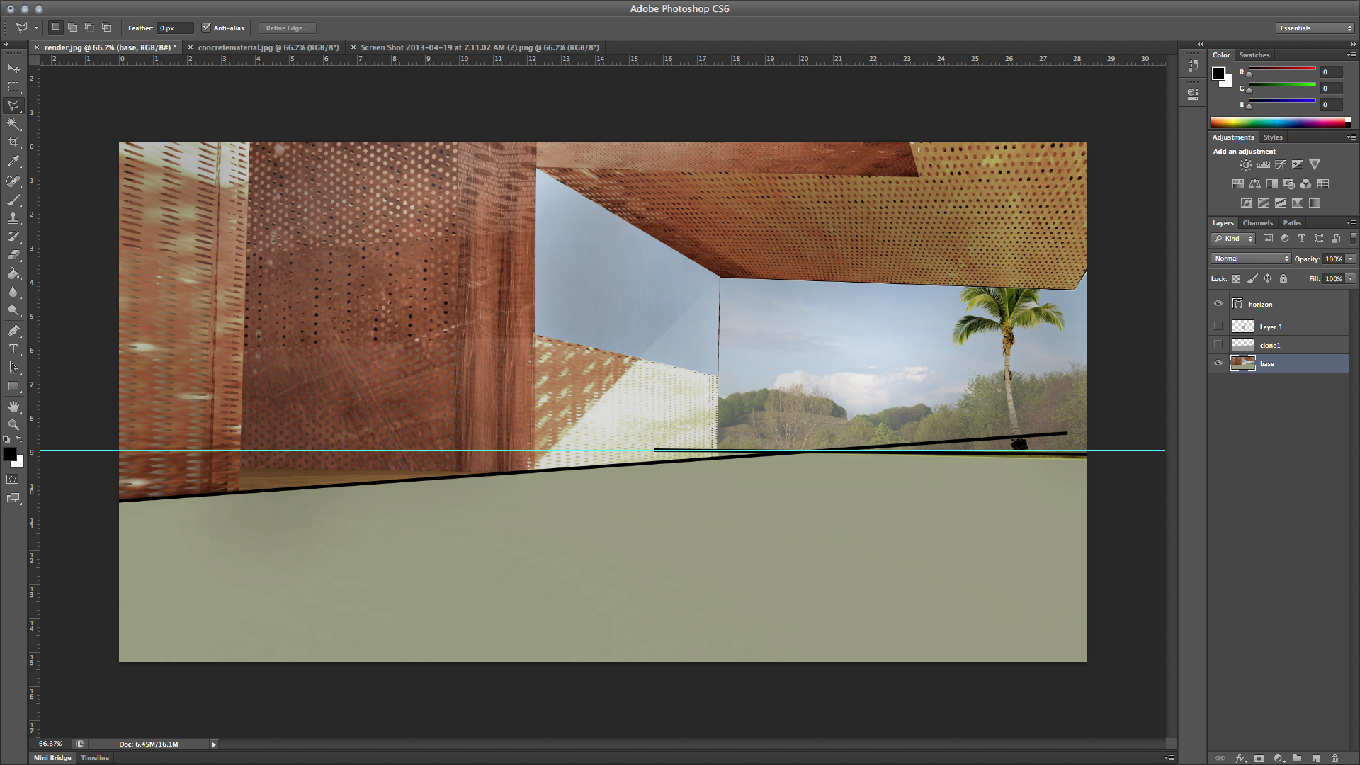
When creating a rendered perspective image, it is crucial to apply entourage in reference to the horizon line in order to create an appropriate spatial reading within the image. This line examples the eye level of the viewer. It is important when you choose your view in Rhino to place the camera at the height of a person in order to display the view at eye level. A tip in achieving this accurately is to construct an object in your Rhino model that is at the height of an average person and snap the camera point to the height of the object.
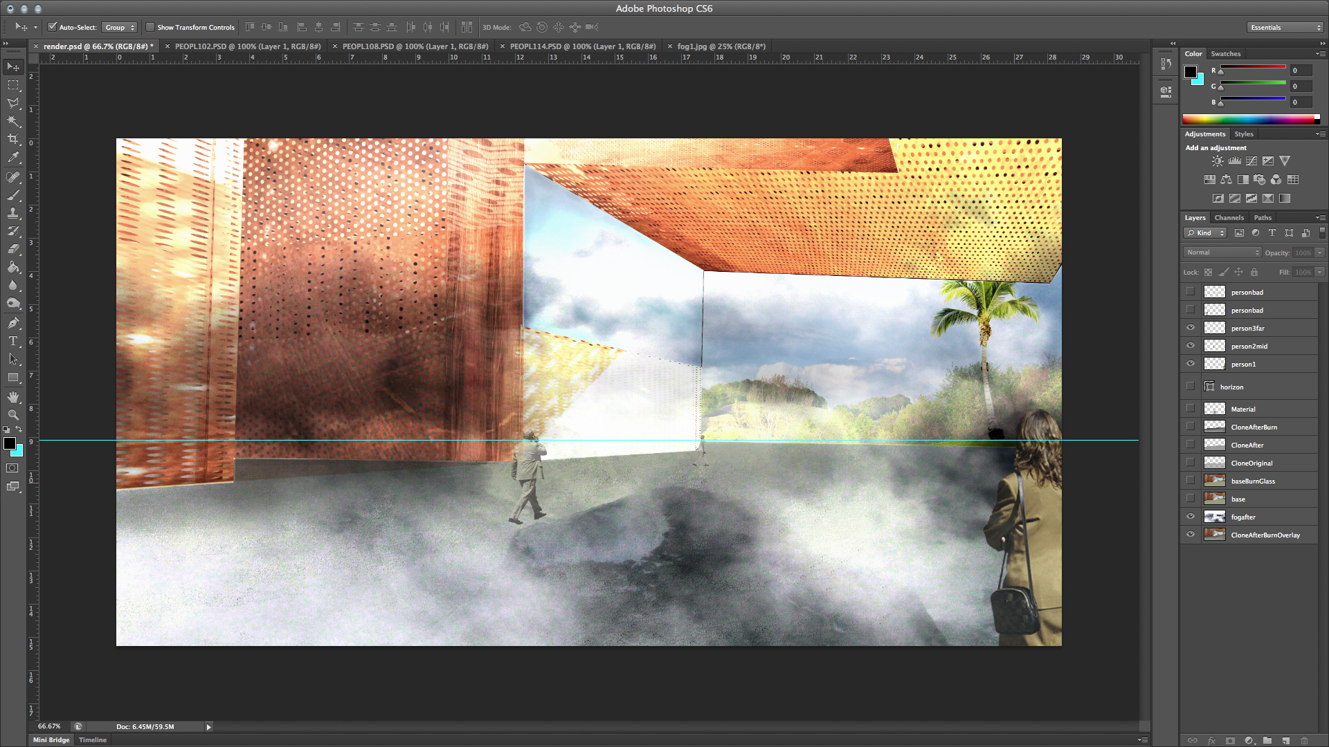
Using the line tool, notate the horizon line by following the ground perspective lines. After doing this, bring down a guideline where the two lines intersect.
Add Additional Materials With Clone Stamp
Using the Clone Stamp Tool you can adjust and create additional materials in your rendered perspective image. This is useful in order to add additional clarity and precision after you have already applied materials in VRay. In this step we are going to create a new concrete material using the Clone Stamp.
First, copy material into workspace in Photoshop and scale the material using Ctrl T or the “transform tool” found under Edit > Transform > Scale. Press “Alt” to Activate a select part of your material and adjust the brush tool diameter as best fit.
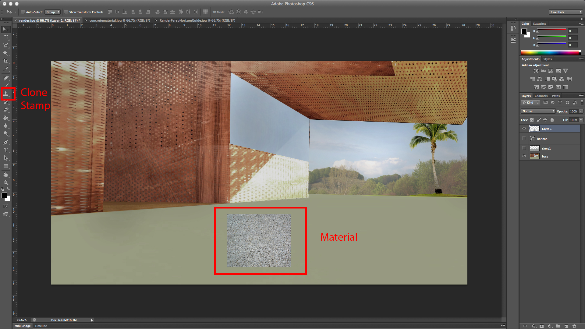
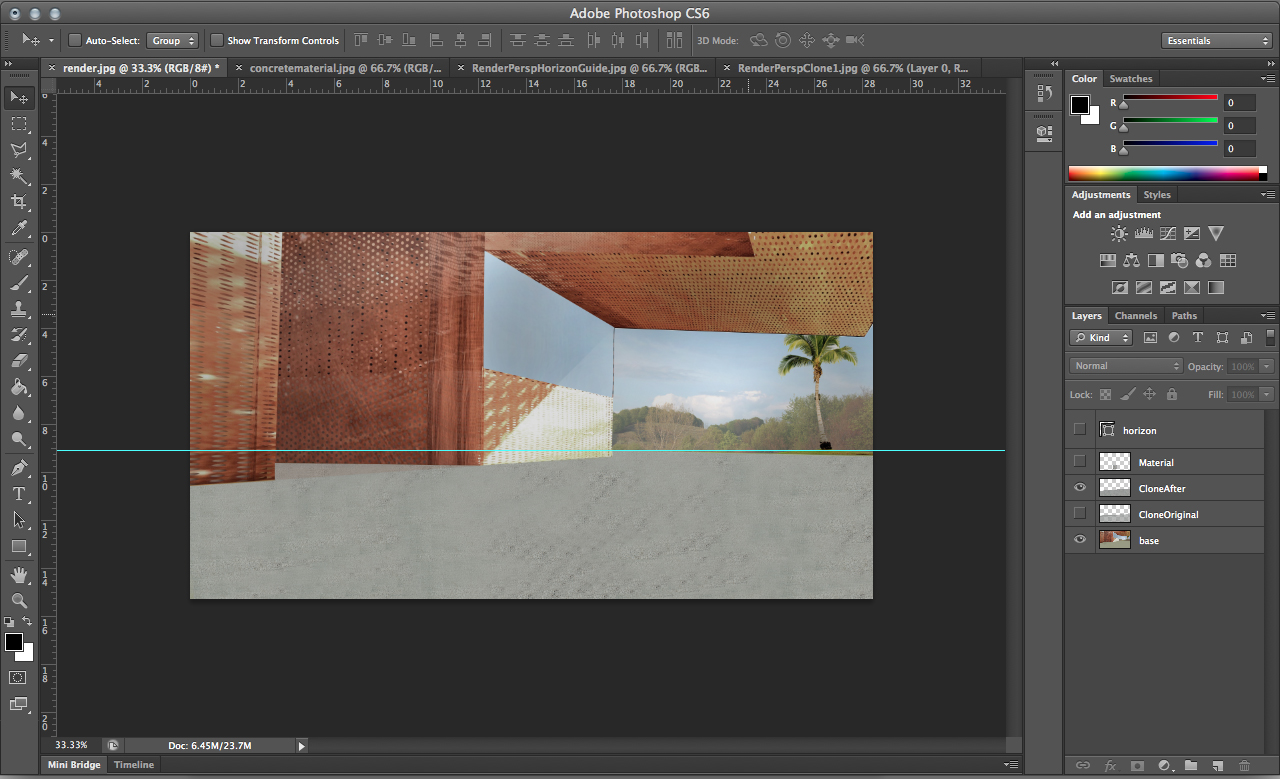
Once you have applied your material over a selected area, use transparency and the lasso tool in order to get rid of any excess or unwanted texture.
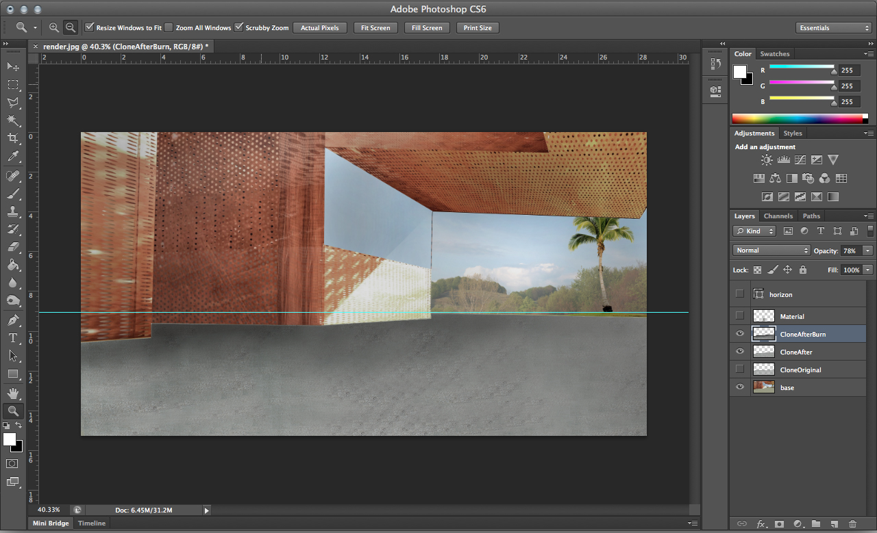
In order to create spatial depth with shadows, mid tones, and highlights refer use the Burn Tool to construct the proper shadow and highlights in the material you created in order to spatially define the appropriate depth.
Add Other Materials and Adjust with Burn Tool
Some materials, such as glass, won’t be as easy to render with tile-able material images. In this case, using simple colors and feigning shadows and highlights will work.
Select the portions of the building that will be glass using the Lasso tool or Magic Wand tool. Use the Paint Bucket tool to fill with a color, preferably a shade typical of glass such as blue or light green. Then, use the Dodge and Burn tools to make the glass appear to have reflectivity. A simple gradient from left to right or top to bottom will typically get the correct effect.
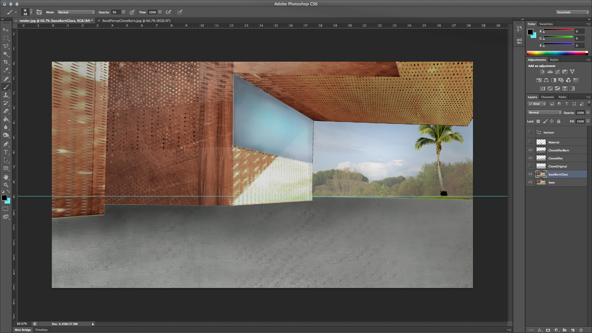
Placing People and Objects into Perspective
When placing entourage in perspective the guide line you created will allow for a more accurate depiction of objects in space. When inserting the objects and people, be sure to manipulate the transparency in the layer the object is on in order to create a reading of further depth. You can also use the brightness/contrast tool found under image > adjustments > brightness/contrast in order to better integrate people, trees, and objects.
Without referencing the guideline:
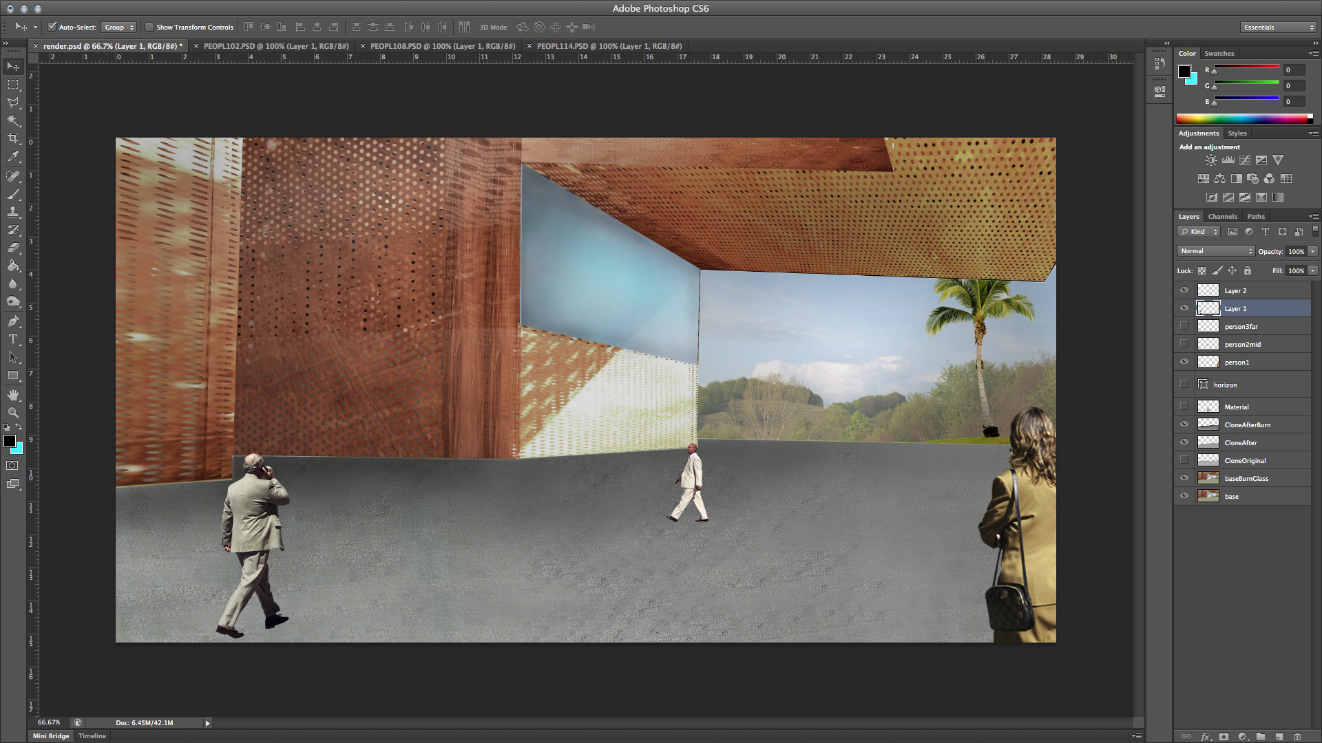
With the guideline:

Adding a Texture Overlay
When creating a rendered perspective drawing, showing climatic instances such as fog or rain can be done simply through the ‘overlay’ texture tool. This tool creates an overlay textured effect that would be difficult to produce with drawing or brush techniques. In this example we will go over how to incorporate fog into the scene.
First, choose a texture image and open in Photoshop. When applying a texture to your rendered image, you will want to make sure the image is desaturated. Use Brightness/Contrast or Levels tools to really contrast the textured image. Copy your image onto your base drawing and layer it above the base image. Make sure your texture is the same screen size as your drawing.
Texture overlay-ed over base image:
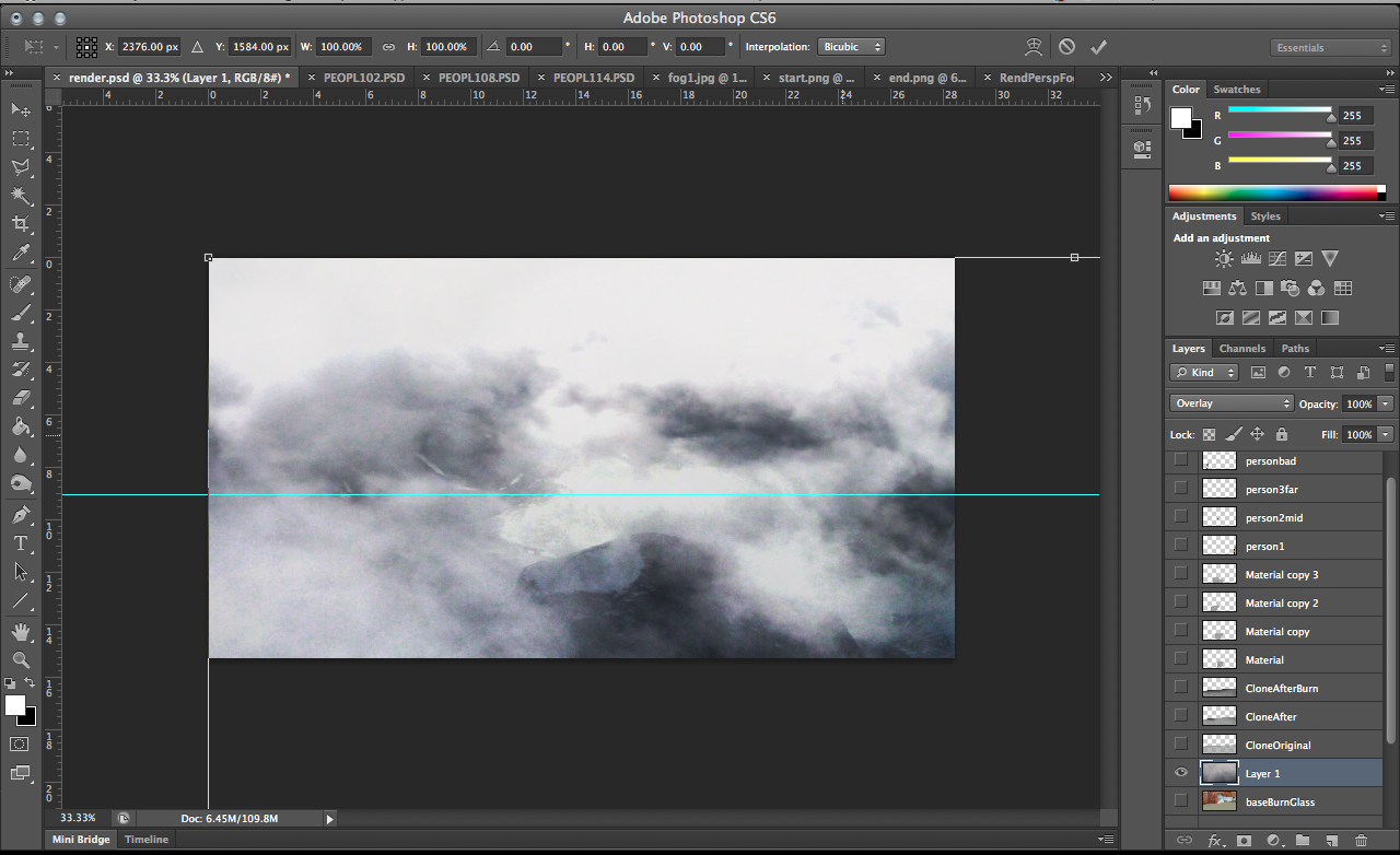
While selecting the texture layer, click on the "normal tab" next to layer transparency. Choose Overlay.
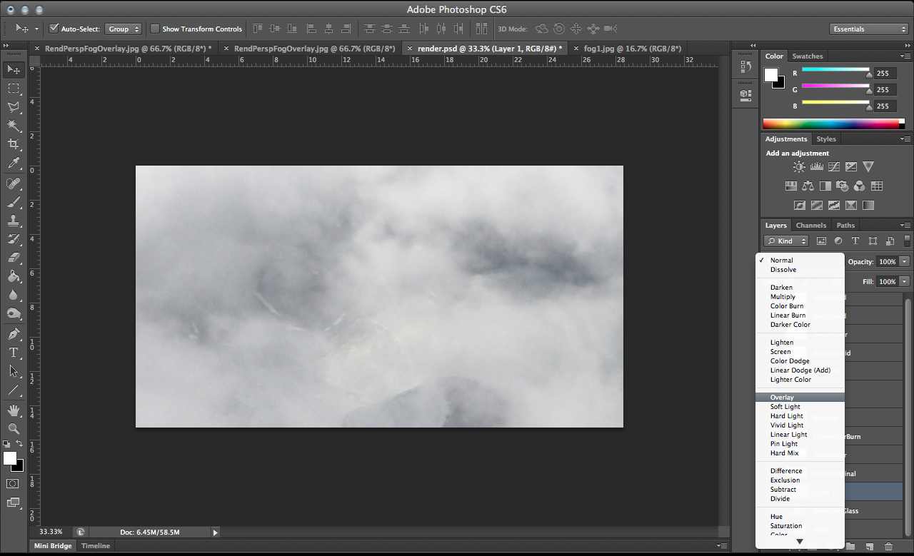
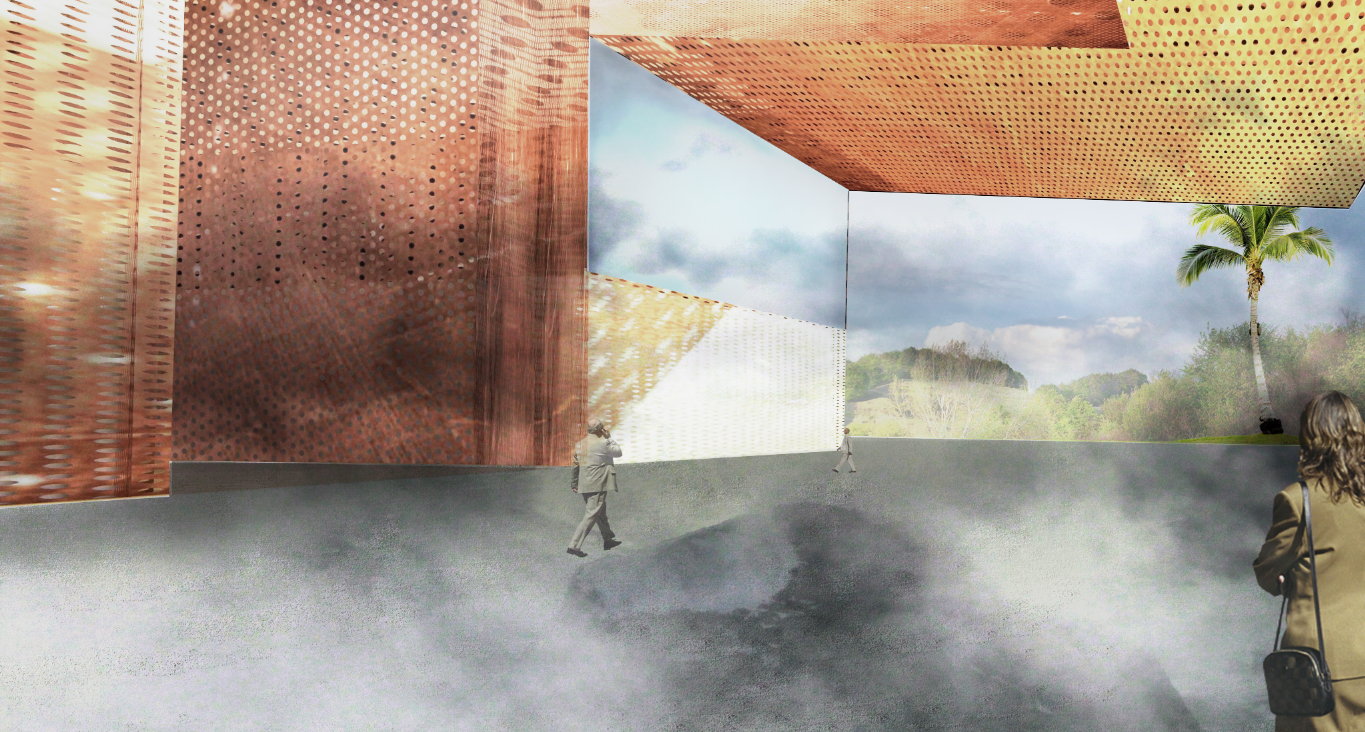
The textured image is now composed on top of your render. Readjust your entourage in space, by using the transparency, brightness/contrast, and levels tools again to incorporate and blend objects into the image accordingly.
Final Rendering
Assignment
Additional Resources
- Photoshop Landscape Tutorial
- Using various brush techniques and shadows to create landscape textures.
- CG Textures
- Tileable and non-tileable images for many different materials.
- Graphic Addiction
- Blog of student architecture projects models and drawings.
- Drawing Architecture
- Blog of student and professional architectural drawings.
