|
Lighting Adjustments & Select Pixel Editing in Photoshop |
|
|---|---|
| Screenshot | |
| This workflow teaches Photoshop as a tool for adjusting lighting properties within separate layers and manipulating select pixel groupings for an overall photorealistic effect. Adjustment Layers (including filters and transparencies) and basic pixel editing are emphasized. Students will learn an efficient process in lighting adjustments and pixel editing which can be used throughout the design process; from concept development through presentation renderings. | |
| Uses Tool(s) | Photoshop CS5 |
Steps
Identifying Layer Inconsistencies
To begin this workflow we will explore techniques in manipulating lighting properties within separate layers.
The first step after opening Photoshop is to open the file "Workflow 2.psd". Here we will see an image combining a container yard with the De Young Museum Tower, The Hearst Tower, and a man relaxing in the sunshine.
- Workflow 2.psd
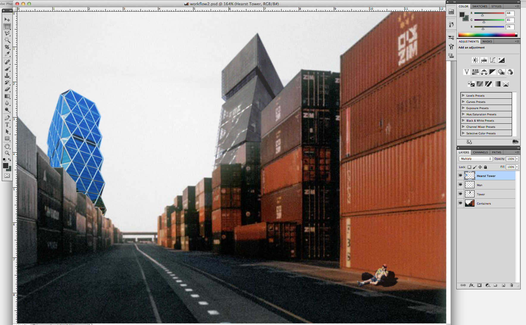 The De Young Tower and the man are integrated into the container landscape. The Hearst Tower is not. When we focus further into the Hearst Tower section of the image, we can begin to identify how to better integrate the Hearst Tower into the composition. Either select the MAGNIFYING GLASS TOOL from the main toolbar or hold the OPTION KEY and using your mouse scroll zoom into the Hearst Tower.
- Hearst Tower Magnified
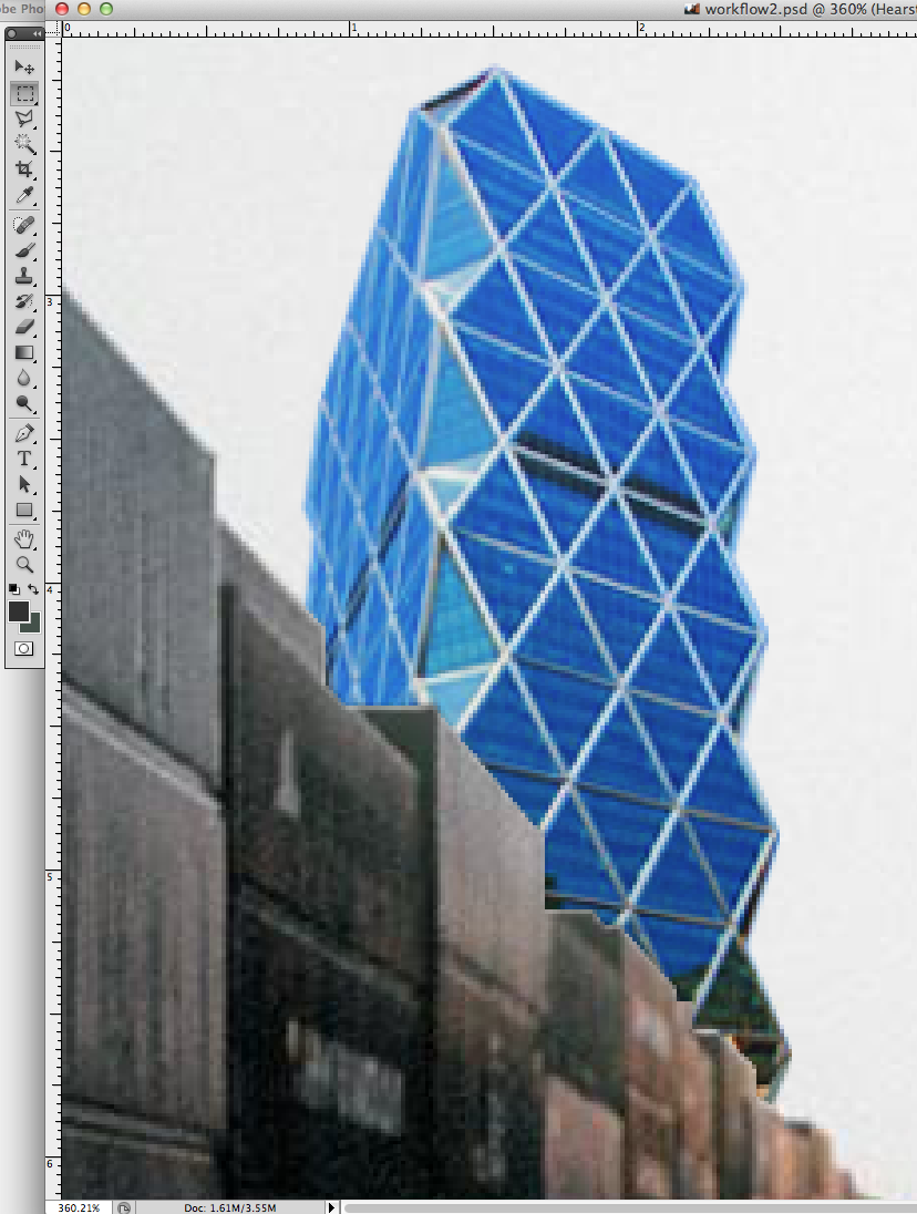 From a closer magnification we can begin to understand the pixel relationships between the Hearst Tower, the sky it is supposed to be sitting in front of, and the containers that it is supposed to be resting behind of. Three conditions involving these relationships must be addressed:
- Light Properties, Surface Inconsistencies & Edge Conditions
 Clearly, the Hearst Tower is not yet compatible with its surroundings because of three significant variables. They are:
1 • The light properties of the Hearst Tower
2 • The glass panels along the bottom right corner of the Hearst Tower that are suggesting the reflection of other surfaces that are not within our composition
3 • The hard and noticeable edge between the Hearst Tower and the containers
The Differences Between Adjustments & Adjustment Layers
Now that we have identified what we need to correct we will begin by manipulating the lighting properties of the tower. This is a good first step because the hard edge between the tower and the containers may become softened as a byproduct of lighting adjustments.
To begin, from the top menu bar select "Image > Adjustments". Here you will see a drop-down menu with an array of lighting adjustment tools to select from. For this particular exercise, the LEVELS and HUE / SATURATION options will be useful.
- Image > Adjustments Drop-Down Menu
 This is a perfectly fie way to begin to adjust the Hearst Tower lighting, however, after we make any adjustments they will be permanently embedded into the pixels of our composition. We can perform the same tasks with greater flexibility by using ADJUSTMENT LAYERS.
To open ADJUSTMENT LAYERS, from the LAYERS PANEL select the two-tone circular icon from the bottom menu bar. The exact list from the Adjustments drop-down will appear.
- Adjustment Layer Menu
 Adjustment layers carry out the exact operations as what is found within the Adjustment menu. However, their advantage is that any adjustment made is stored within a separate layer and can be adjusted periodically as needed. This is a non-destructive form of photo-editing.
Hue / Saturation Layer Adjustments
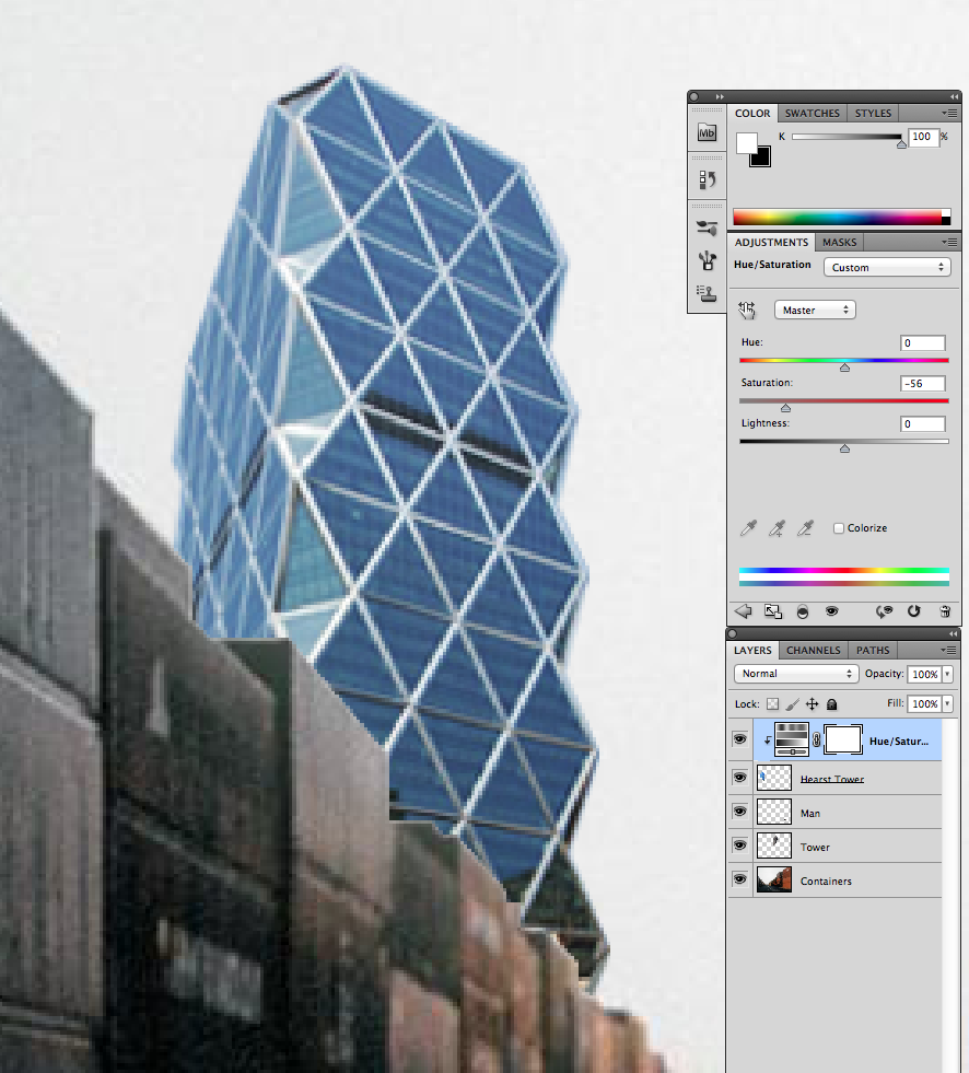
The Hearst Tower appears to be rather divorced from the containers in front of it. This is primarily due to the inconsistency between the color saturation between them. From the ADJUSTMENT LAYERS MENU select HUE / SATURATION.
If we begin to adjust the sliders we will notice significant adjustments being made to our entire composition. This is because the HUE / SATURATION command has placed a new layer on top of our existing layers. Any transparency / lighting manipulation from an above layer influences all layers below it.
- Hue / Saturation Transparency Manipulation - Composition
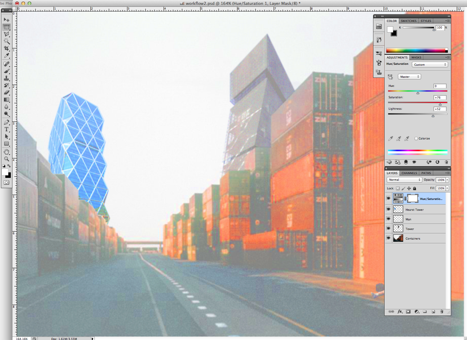
In the case of this workflow, we only want to photo-manipulate the Hearst Tower. To do so, select the double circle icon from the bottom menu bar.
- Transparency Manipulation - Single Layer

Now that we have isolated the Hearst Tower Layer we can begin to finely adjust the SATURATION until the tower begins to tonally relate with the containers without loosing its identity as a structure made from blue tinted glass.
- Tonal Consistency
Levels Layer Adjustments
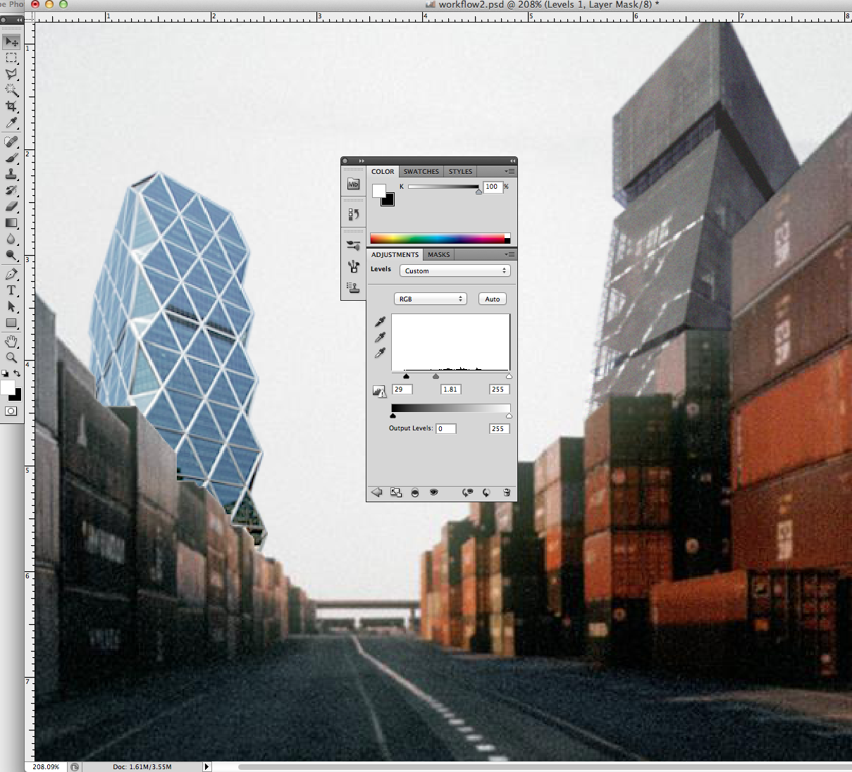
From the ADJUSTMENT LAYERS menu another useful tool is LEVELS. Here we can adjust brightness, contrast, and tonal range by specifying the location of complete black, complete white, and midtones in a histogram. By adjusting these respective sliders (and isolating the Hearst Tower Layer below) we can begin to adjust the Hearst Tower to seamlessly integrate with the landscape.
- Levels Adjustment Layer
Correcting Surface Inconsistencies
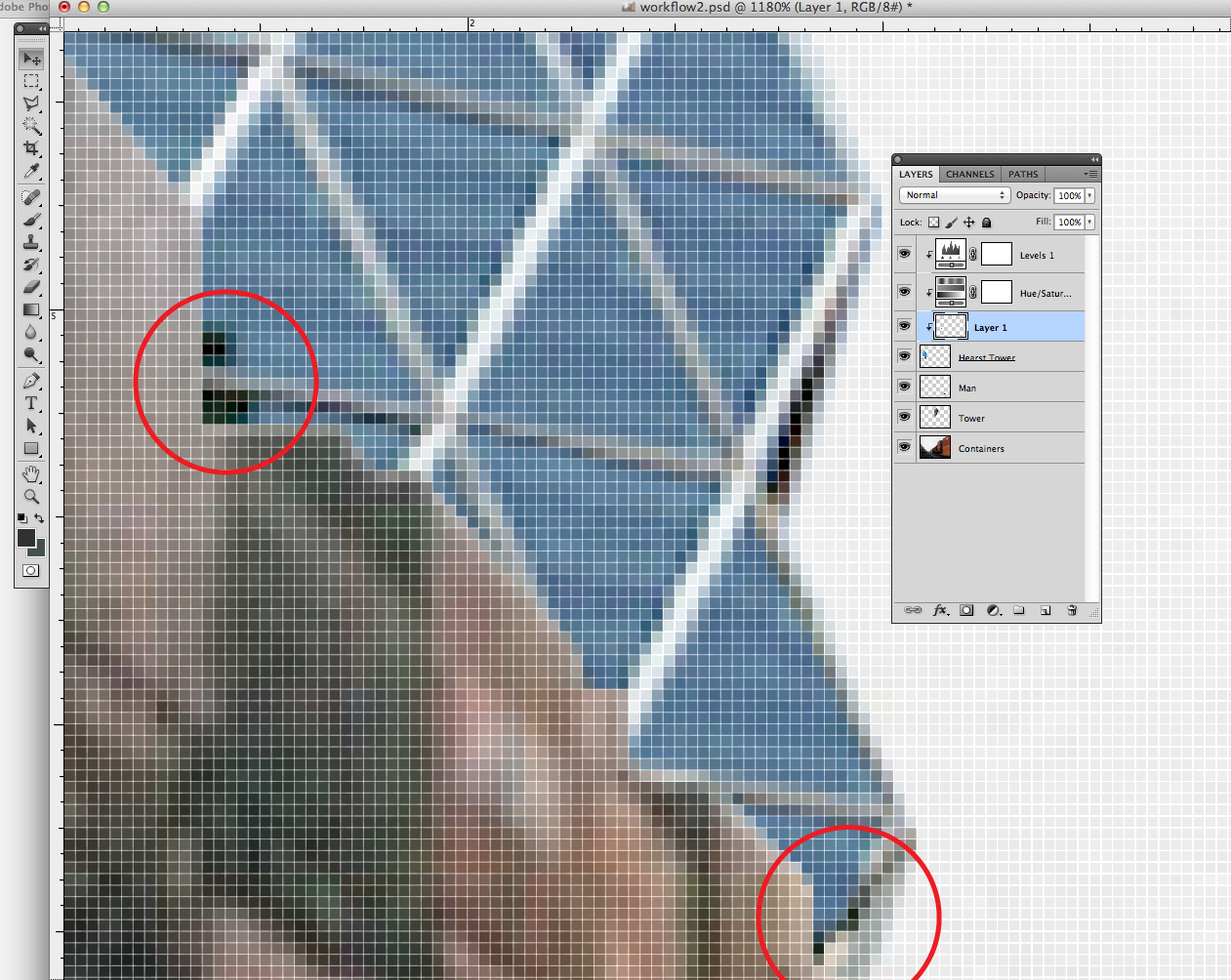
The symmetrical geometry and material uniformity of the Hearst Tower exaggerates any inconsistencies visible throughout its surface. Within the bottom righthand corner of the building we can see two darker glass panels that indicate a reflection. This is inconsistent with how we have situated the tower within the landscape. Fortunately, the geometry of the tower is stringently repetitive.
Select the POLYGON LASSO TOOL from the main toolbar and zoom into the bottom righthand portion of the Hearst Tower. From here, carefully select a replacement panel from above. Remember to work within the HEARST TOWER LAYER.
- Selecting a Replacement Panel - Polygon Lasso Tool
 Now, COPY (COMMAND / CONTROL C) and PASTE (COMMAND / CONTROL P). A new layer will automatically be placed above the Hearst Tower Layer. By selecting the MOVE TOOL from the main toolbar (or press the V KEY) we can move the pasted panel onto its needed location. Also, if needed the selection can be scaled and/or rotated by selecting "Edit > Transform > Sacle or Rotate" from the top bar menu.
After the pasted panel is positioned correctly there may be some areas that need to be finely adjusted.
- Further Adjustments
The Clone Stamp Tool
First, it is important to merge the new layer that we just created with the existing Hearst Tower Layer. This will prevent any confusion as we work on cleaning up the different parts of the tower's surface. To merge these two layers, from the LAYERS PANEL, right click on the new pasted layer and select MERGE DOWN.
- Merge Down
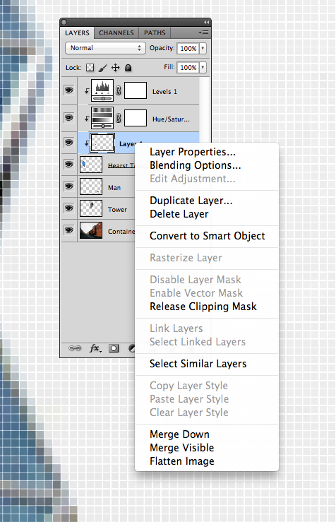
Now select the CLONE STAMP TOOL from the main toolbar. It is represented by an icon of a stamp. You can also select it by simply pressing the S KEY.
The clone stamp tool is allows you to duplicate part of an image. The process involves setting a sampling point (or grouping of pixels) in the image which will be used as a reference to create a new cloned area. Different filters and opacity levels can be selected within the options menu bar (beneath the top menu bar). For our purposes we will be operating in NORMAL MODE and with 100% OPACITY.
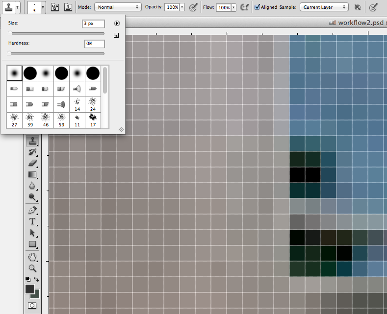
After you select the CLONE STAMP TOOL, zoom into one of our two areas to be corrected. A circle will be visible. This circle indicates the area that the CLONE STAMP TOOL will sample. Because we are working within a tight space we will need to select a smaller sample size. To do so open the BRUSH PANEL on the top left icon from the options menu bar. Here different BRUSH sizes and types can be selected.
- Clone Stamp Tool Brush Options
3 px is a good size for our purposes with the Hearst Tower. After selecting your brush size, move your cursor over the Hearst Tower image and hold the OPTION / ALT KEY. The CIRCLE selection area will turn into CROSSHAIRS. Click a sample area (while holding the OPTION / ALT KEY). Release the OPTION / ALT KEY (the CIRCLE selection area will reappear) and click on the pixels that you wish to apply the cloned area to.
Carefully continue this process until the imperfections are replaced with new cloned pixels.
- Applying Clone Stamp Tool
Opacity
We now have our Hearst Tower pretty well integrated with its surroundings. However there are a couple more details to really create a convincing marriage between the two.
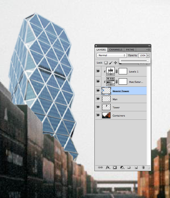
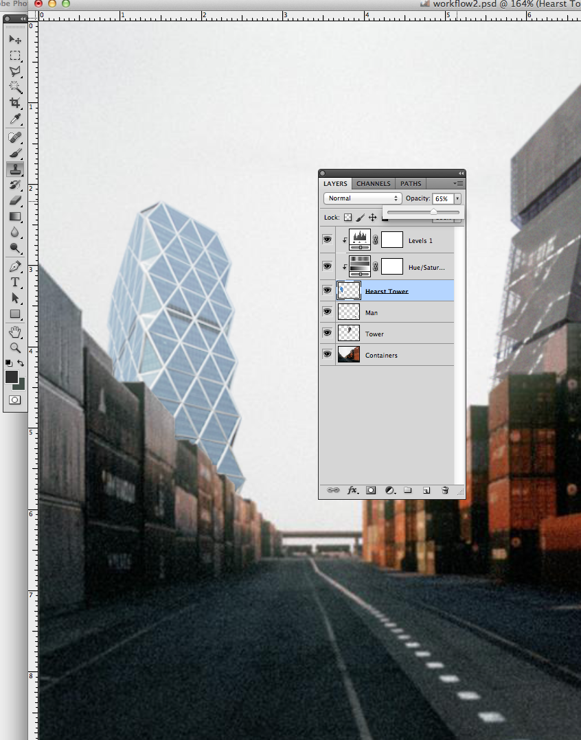
First off, we can diminish the hard separation between the tower and the container edges by simply lightening the OPACITY. From the LAYERS PANEL select the OPACITY drop-down menu. By using this slider the Hearst Tower will become more transparent and blend in better with the container edge.
- Opacity Adjustment
Noise
Now for the final touches, you will notice that the CONTAINERS LAYER has a bit of noise, or surface texture. This quality is consistent throughout the entire layer. We can easily replicate this effect for the HEARST TOWER LAYER.
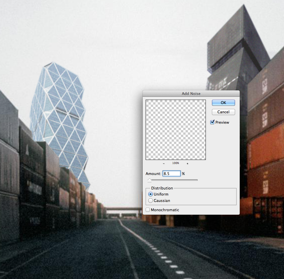
From the top bar menu select "Filter > Noise > Add Noise". A panel will pop up. Make sure to select the PREVIEW option box and begin to experiment with the noise levels.
For this particular image only a bit of added noise is needed to convincingly embed the Hearst Tower.
- Adding Noise
Final Composition
Through Adjustment Layers, Pixel Selection, the Clone Stamp Tool, Opacity & Filters we are able to create an image that convincingly merges disparate items into a unified composition.
- Final Composition

