|
Mapping the Site using 2D Rhino + Illustrator |
|
|---|---|
| Screenshot | |
| This workflow explores how to create site diagrams at the large urban scale using data from historical maps. Students will learn how to isolate existing sets of information and abstract them into a multi-layered composition that is both unique and evocative. Emphasis is placed on the relationships and overlap between these different sets of information. | |
| Uses Tool(s) | Rhinoceros , Illustrator CS5 |
Files
This workflow uses this Rhino file as a base drawing. It is a basic site plan of San Francisco's Embarcadero area, including the streets and curbs. We will then add additional layers of information on top of this drawing in Rhino, before exporting to Illustrator to refine the map.
Before starting the exercise, you will also need to download this composite image from Google Earth, and this historical map of buried ships.
Steps in Rhino
Gathering Information from the Google Earth Image
After opening the Rhino file, create a new layer called "Google Earth Image" and make this the current layer. Lock all of the other layers so the linework doesn't accidentally get messed up. Use the PictureFrame command to place the provided Google Earth aerial image next to the linework of the San Francisco city map. Hold down shift while clicking the reference points for hte picture frame, so the image isn't placed at an angle. In the top right corner of the image, there is a graphic scale that indicates what size the image should be. Use the Scale command to re-size the image so it will match up with the city map. Select the image and type "Scale." You'll need to zoom way in to be very precise during this part. For the origin point, click on the left side of the graphic scale. Click the right side of the graphic scale for the first reference point, then type 2578 and hit enter.

Tracing the Piers
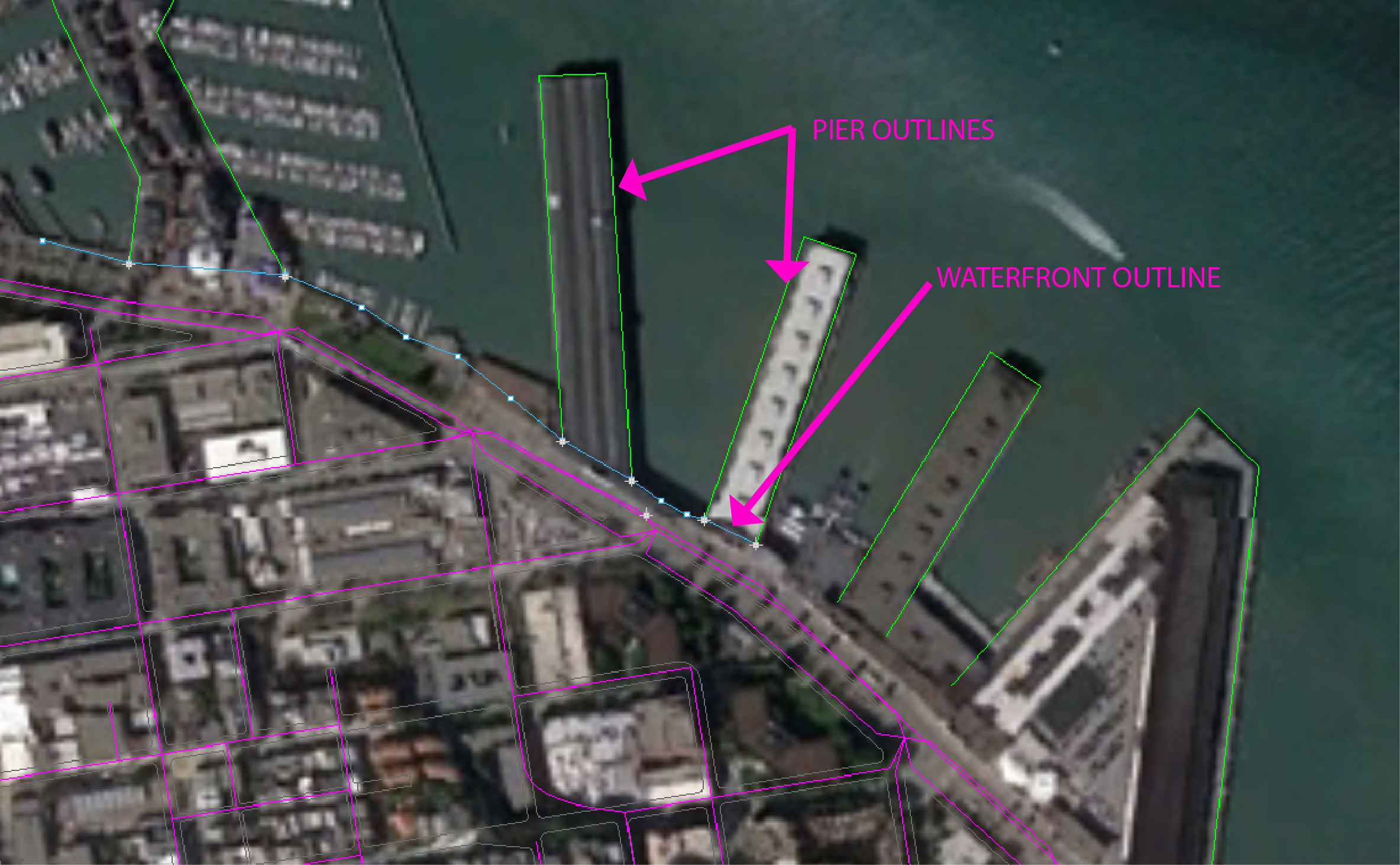
Next, create a new layer called "Piers." Make this layer current, and lock the Google Earth image. Trace over the outline of each individual pier using the Polyline command. This will create a series of open curves. Zoom in, take your time, and try to be as precise as possible while tracing these lines, even though the resolution of the Google Earth image is not perfect. You'll probably want to temporarily disable your Osnaps so that the polyline doesn't accidentally snap to any incorrect points. In the command line, the default "Mode" for the Polyline command is Line. This will give straight line segments between each point you click. However, if you need to make any curved line segments while tracing, you can change the Mode to Arc at any point by typing "M."
Tracing the Waterfront
Create a new layer called "Waterfront." Once more, use the Polyline command to trace the line of the waterfront, toggling back and forth between "Line" and "Arc" mode as needed. This line should connect across the base of each pier, so make sure the End Osnap is on so you can snap to the endpoints of the pier outlines you just drew.
Gathering Information from the Buried Ships Map=
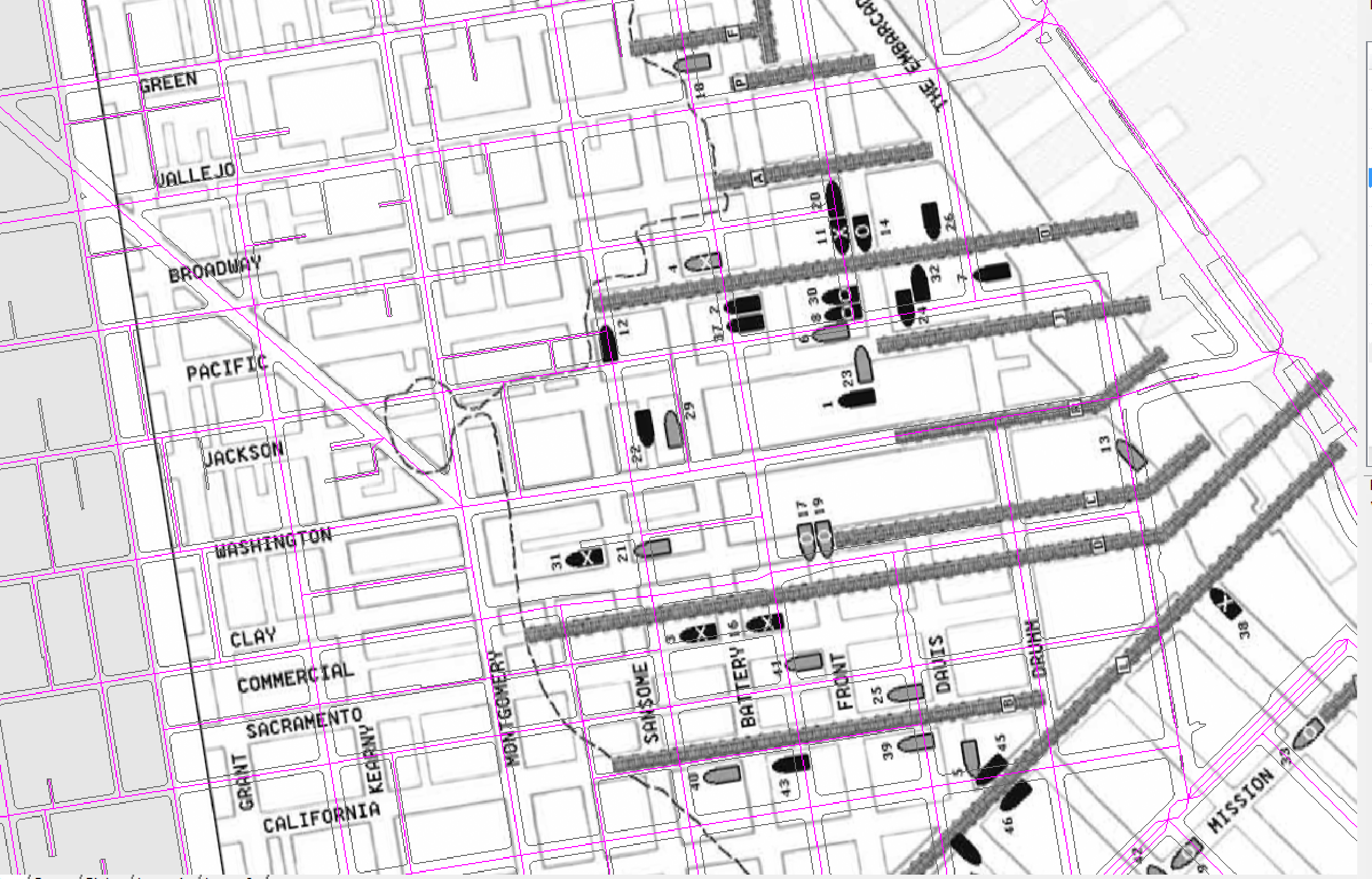
Turn off the "Google Earth Image" layer and lock the "Pier" and "Waterfront" layers. Create a new layer called "Buried Ships Map" and make it the current layer. Again, use the PictureFrame command to insert the provided map of buried ships, holding down shift as you click to ensure that the map is inserted at a straight angle. You'll notice that the angle of the streets in this map do not correspond to the angle of streets in the base drawing. In order to make them line up, Rotate the Buried Ships map 9 degrees. Now move the image on top of the linework, and scale the image so that it matches up with the linework. It's helpful to use the start of Broadway (the diagonal street) as a reference point. Then, Scale the image so that the block sizes line up.

Tracing Over Old Wharves
Create a new layer called "Old Wharves" and make it current. Lock the "Buried Ships Map" layer. Now, start tracing over the old wharves, which are the dark gray rectangles on the map (see legend). Use the Rectangle' command and type "P" to select the 3Point option. This will allow you to create a rectangle at any angle. Choose one of the wharves to start with. The first two clicks will be the bottom left and top left corners of the wharf; the third click will be the top right corner of the wharf.
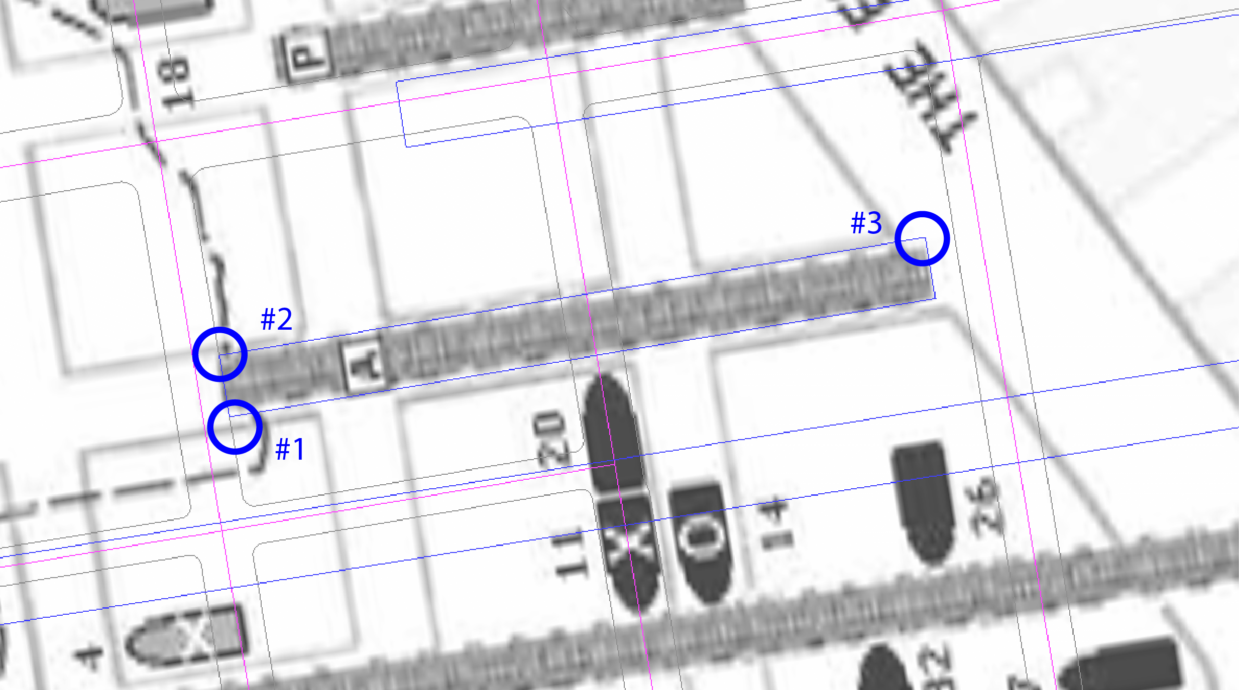
Now, Copy this rectangle to all of the other wharves that are at this same angle. This will ensure that all of the wharves have a standard width and direction. Then, use the Scale1D command to adjust the length of each wharf. This way, the wharves are all of a standard width and angle.
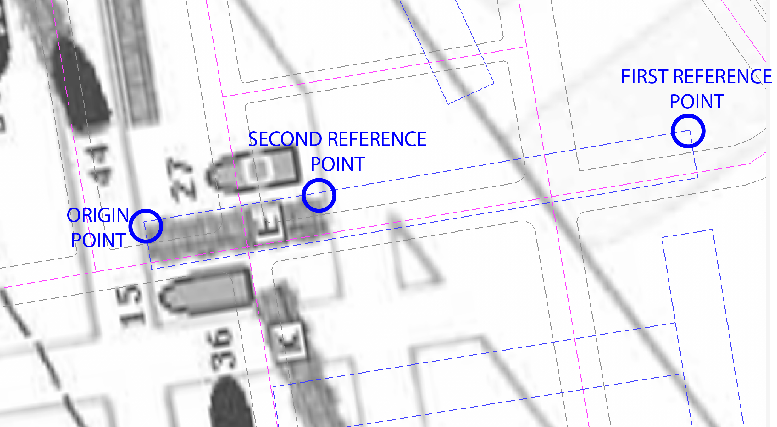
There are also piers at other angles. Copy the original rectangle again and Rotate it until it matches the angle of the wharf. Repeat the Copy and Scale1D process for all parallel wharves, until all of the wharves have been traced over.
Tracing Over Old Waterfront
Create a new layer called "Old Waterfront" and lock the "Old Wharves" layer. Now, trace over the dotted line in the map, which represents the old shoreline. Since this line has many curves, it's easiest to use the Curve command. Keep in mind when you use this command that the distance between the points you click is very important. The closer together the points are, the tighter the curve will adhere to the points. If the points are far apart, the curve will be very loose. So, when tracing over tight corners, make sure you are using a lot of control points to keep the curve accurate.
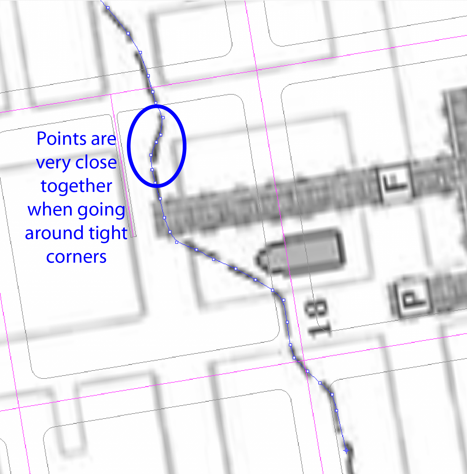
Tracing Over Buried Ships
Create a new layer called "Buried Ships" and lock the "Old Waterfront" layer. Create sub-layers within the "Buried Ships" group based on each of the ship categories listed in the map's legend: "Discovered," "Possible," "Broken Up," and "Vicinity."
Draw a small circle in the center of one of the ships. Then, copy this circle on top of all of the other ships. Go back through and change each circle to the correct layer (i.e. if the circle is on a gray ship symbol, it should go on the "Broken Up" layer).

Exporting to Illustrator
After you are done tracing all the information from the maps, make sure your finished drawing is located near the origin point (0,0,0). If not, move it there (making sure all of the layers are unlocked first). Now, organize your layers for exporting. Make sure that all of the base drawing layers are unlocked (Streets, Freeways, Curbs, etc). Make sure that the two image layers are turned off and locked (Google Earth image and Buried Ships map). Make sure that the layers you drew are all unlocked (Piers, Waterfront, Old Wharves, Old Waterfront, and Buried Ship layers). Select everything and Export as an .ai file, making sure that the "Preserve Model Scale" box is checked. Scale the drawing by 1:5000 so that it will mostly fit on an 11" x 17" sheet of paper.
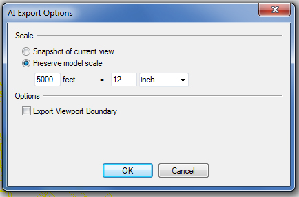
NOTE: 1:500 is a metric scale, which is different than the architectural scales we are used to (i.e. 1/4" = 1'-0"). Instead of going through a conversion from inches to feet, this metric scale simply scales the drawing down by a factor of 5000. In the dialogue box after exporting, type "5000 feet = 12 inches."
Steps in Illustrator
Open the file in Illustrator; this is where the majority of the work takes place to refine the map so that it is legible. Change the artboard size to 11" wide by 17" tall. Select all of the linework using Control+A, and move it into position. As you'll notice, not ALL of the linework will fit on the artboard. Adjust it so that all of the mapping information fits on the artboard (use the old waterfront line as your reference point). The base drawing will extend off of the artboard to the left and bottom, this is expected so don't worry. Just make sure all of the important information fits cleanly.
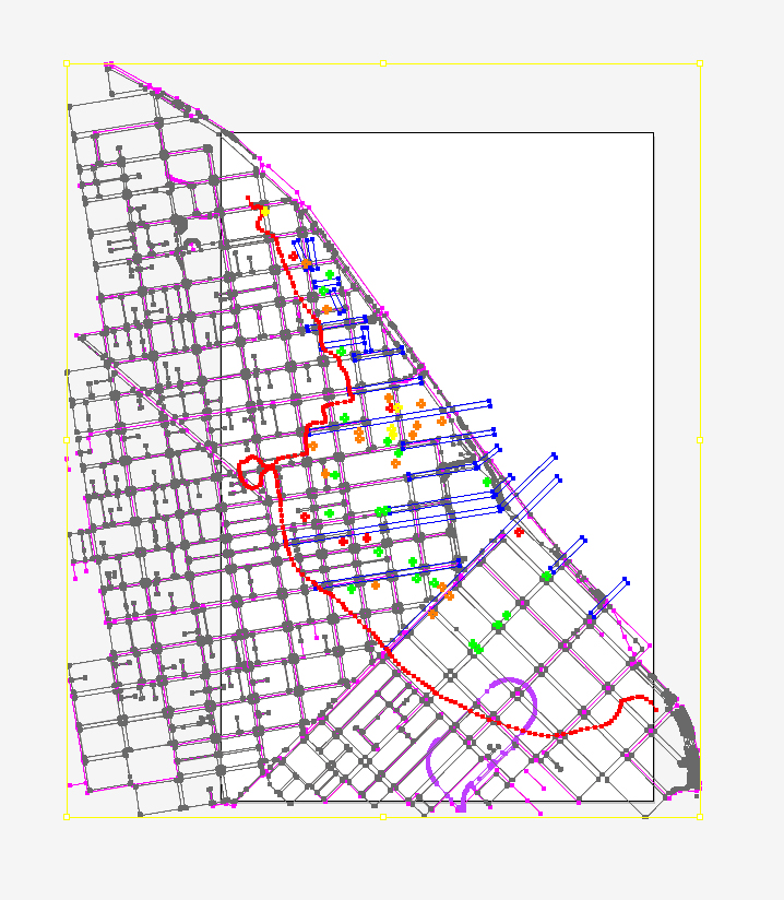
Lineweights for Base Drawing
The first step is to clean up the linework from the base drawing. Select all of these layers and change the stroke to black. Now, assign lineweights to each individual layer. The "Streets" and "Freeways" layers should both be about 0.5 pt . The "Curbs" layer needs to be much lighter to avoid overwhelming the rest of the map. I suggest 0.2 pt lineweight, and changing the stroke to gray instead of black will also help.
Lineweights for Mapping Data
Now apply lineweights to the additional layers you added in Rhino. The new "Piers" layer is an important feature since we are comparing the old waterfront to the new. Therefore, this layer should be fairly prominent, with a black stroke of 1 pt. The new "Waterfront" layer should also be black with a 2 pt stroke, but this layer will have a dash of 4 + 6 pt. The "Old Waterfront" layer should have the same stroke and dash as the new waterfront layer (2 pt thick, dash 4 + 6), but it should have a BRIGHT RED stroke instead to make it pop out.
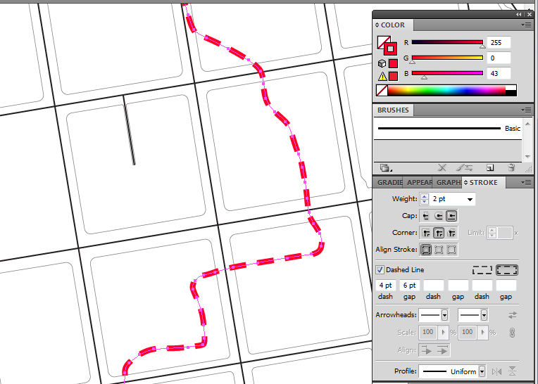
Symbols
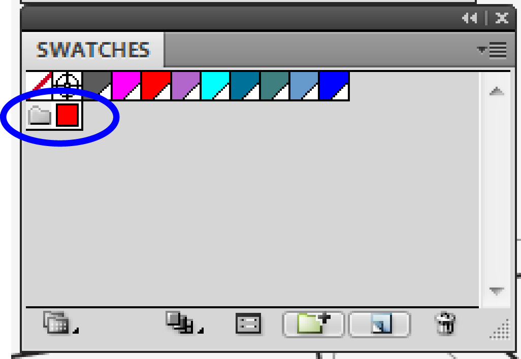
It is now time to start working on the symbols of information that were added in Rhino. This includes the old wharves and all of the buried ships. Make sure that the Swatches panel is open before you start, Window>Swatches. Create a New Color Group of swatches named "Buried Ship Map."

Use the eyedropper tool to select the bright red color used for the stroke of the old waterfront layer. Drag this color into the new color group you just created in the swatches panel.
Old Wharves
Select all of the objects on this layer by clicking the circle next to the layer name. They should have a dark grey fill and no stroke. After you finish this, drag the dark gray color you selected into the "Swatches" group you just created, so that you can refer to it later.
Buried Ships
You'll notice that the circles you drew on top of all the ships look a bit small now. We want to make them larger so they will appear more prominently. Select all of the buried ship layers (Discovered, Possible, Broken Up, and Vicinity) and go to Object>Transform>Transform Each. This will allow us to scale up the size of the circles without changing their individual positions. Scale to 150% uniform (the same percentage for both the horizontal and vertical values).
Now, use fill and stroke to differentiate each layer. The "Discovered" ships layer should have a bright red fill and no stroke. To make sure it's the correct shade of red, drag the bright red color from the swatches panel into the Stroke panel and let go. The other 3 layers should be as follows:
- The "Possible" ships layer should have no fill and a bright red stroke of 2 pt.
- The "Broken Up" ships layer should have no fill and a bright orange stroke of 2 pt.
- The "Vicinity" ships layer should have no fill and a bright yellow stroke of 2 pt.
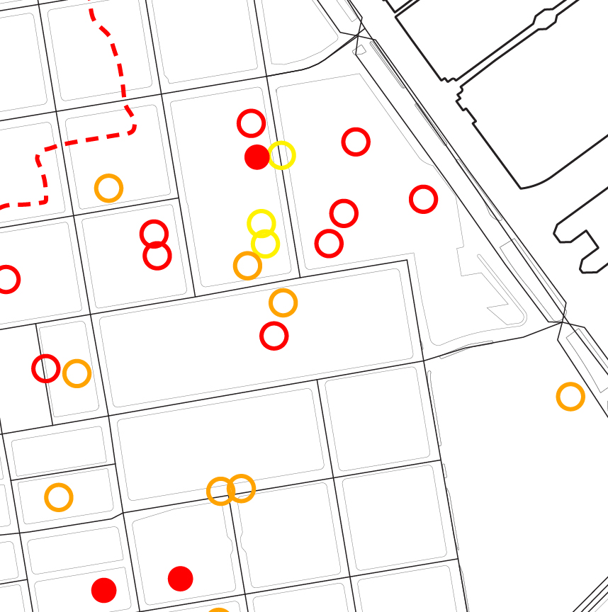
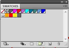
Now, there should be 4 visually different types of circles. Feel free to experiment a little with the specific colors if you want. Before doing anything else, save each of these colors using the Swatches panel. Drag the bright orange and yellow colors into the Swatches panel so that we can refer to them later.
New Piers
We will now use the Live Paint tool to add a light grey fill color to the modern-day piers. The Live Paint tool can be useful when you want to add color to objects on different layers. It is an alternative to tracing over your linework again and creating separate fill layers. It can be a very useful tool, but you must follow the rules carefully to ensure it works correctly.
The most important thing to do is COPY all of your linework before using the Live Paint tool. This is because it will collapse all of your layers and ruin your layer organization. Select all objects on the "Waterfront" and "Piers" layer and copy them over to the right side of the workspace (holding down alt + shift to make sure you're dragging your copy over in a straight line).
Go to Object>Live Paint>Make , and you'll see that all of the objects change to the same color selection, and little boxes will appear at the four corners. This means that the objects are now a "Live Paint Group"--a single entity on one layer. Create a new layer called "Live Paint" and move this group onto that layer, making sure that it is at the bottom of the layers panel.
In the left toolbar, select the live paint bucket tool icon (shortcut: type K) and choose a light gray color in the fill panel. Let your mouse hover over the pier area, and you should see a red border appear over the area you're going to fill in. Just click once, and it will fill in the piers with the color you selected. Now, click on the live paint group and change the stroke to nothing. Hold down shift and drag the group back into position beneath the rest of the linework. At this point, you may have to change the opacity of the live paint group to make it more subtle. Click on the circle next to the "Live Paint" layer name, and change the opacity to 70% (or whatever you think looks best). Lastly, drag the light gray color you selected into the "Swatches" panel.
Legend
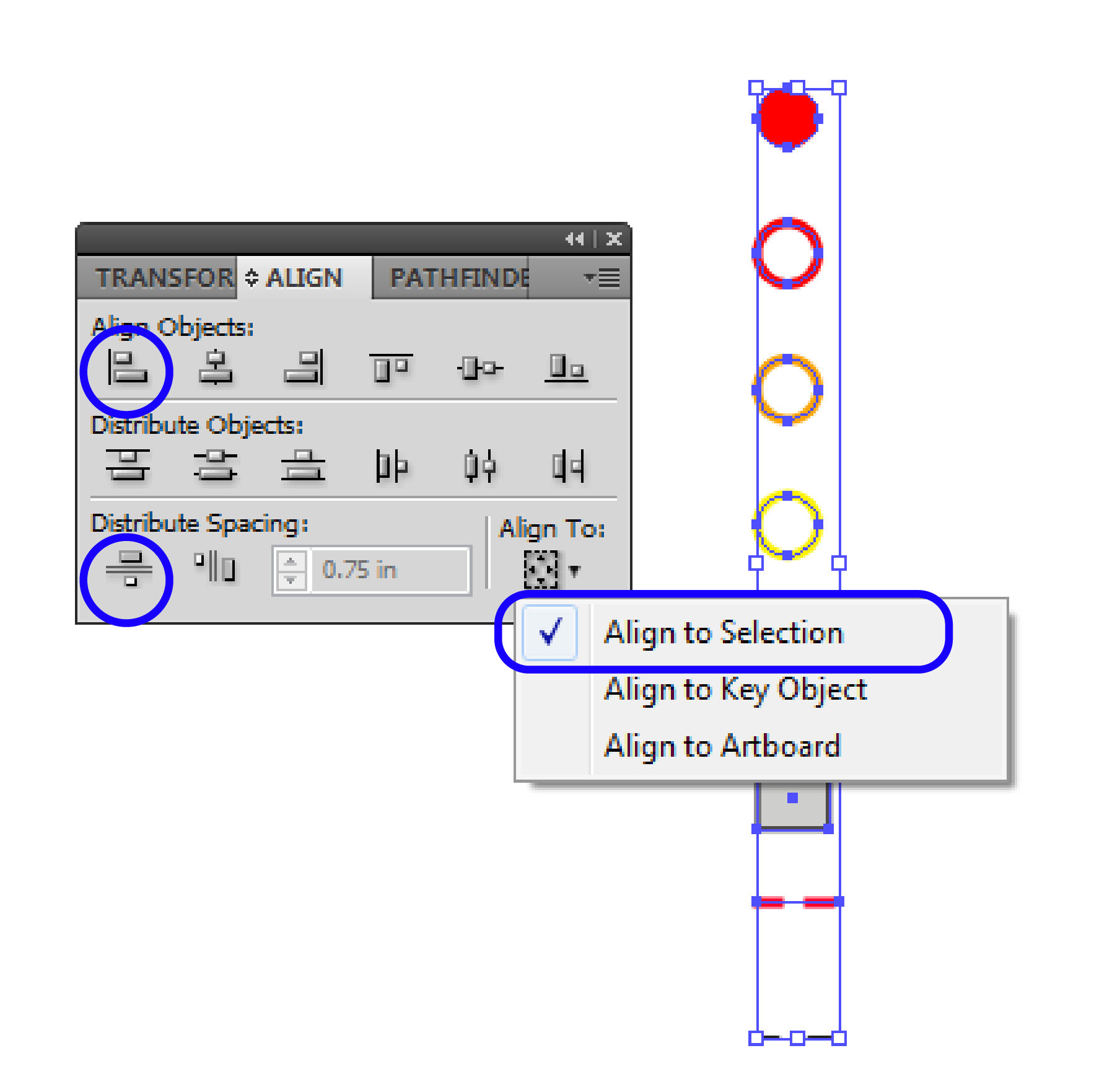
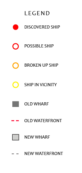
Now we'll make a legend for the data symbols. Start by copying one of the ship circles over to the side of the page. Create a new layer called "Legend" and move the circle to this layer. Copy the circle 3 more times, it doesn't matter where exactly you're copying them to because we'll organize them in the next step. Now, change the color of each circle by dragging swatches from the swatches panel into the fill or stroke panel. The 4 circles should graphically correspond to the 4 buried ship layers in your map. Draw a small box and drag the dark gray swatch to make it match the color of the old wharves. Copy this box, and drag the light gray swatch to make it match the new piers. Draw a short line and match the red dash of the old waterfront line. Repeat this step for the new waterfront line.
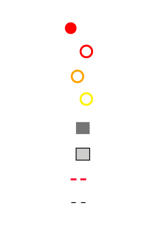
Now we'll use the Align tool to set up our legend, Window>Align. Select all of the little symbols that were just created. Make sure that the box in the lower right corner of the panel is set to "Align to Selection." Click the icon in the top row that says "Horizontal Align Left" to make sure that the left edges of the symbols all line up. Then click the icon in the bottom row that says "Vertical Distribute Space" to make sure that there is even spacing between each icon.
Text
Now use the text tool and create labels for each symbol. Hold down alt + shift to copy the labels and drag them vertically until everything lines up.
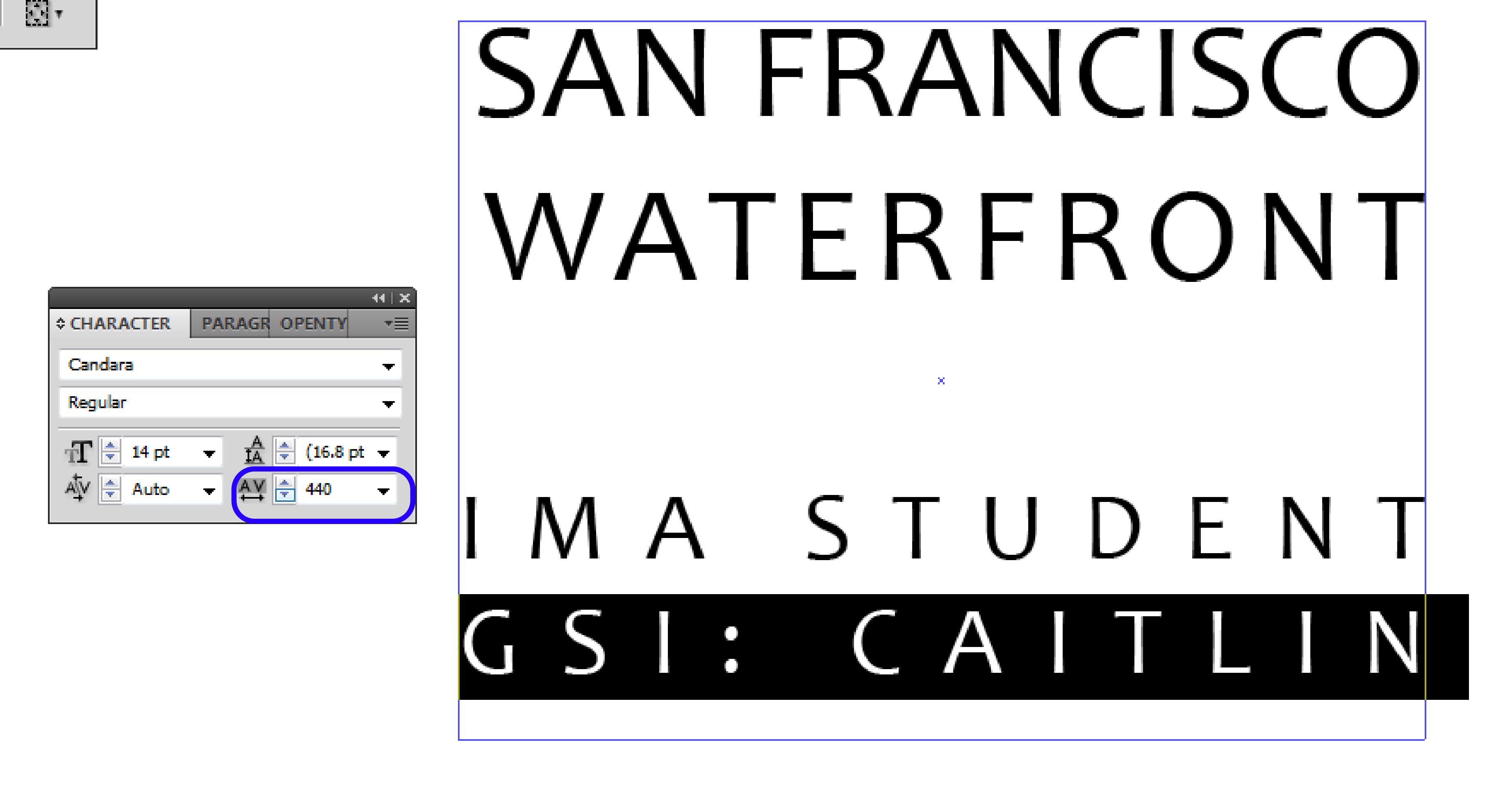
Lastly, use the text tool to create a title for the map. Make sure to include your name and your GSI's name. For extra credit, play with the Tracking of each line of text so they align on both ends. The Tracking option is found in the "Character" Panel, Window>Type>Character (shortcut: Control + T). Increase the tracking of the shorter lines so the letters are more spaced out.
Submission
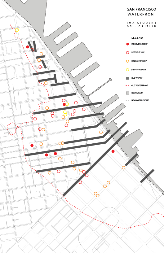
Print your map out on an 11" x 17" portrait sheet. When you print, select "do not scale" so that it doesn't try to shrink your linework down. This means that it will cut off about 1/4" of linework on the left and bottom edges, which is fine.
Turn the hard copy in by 5:00 pm to the elevator bins in the 6th/7th floor elevator lobbies.
Common Problems
- I can't see the image of the historical map after I place it in Rhino. Why?
When the PictureFrame command is used, it brings in the selected image as a textured surface. This means that the image is actually an object in the Rhino workspace, visible in all viewports. If the image is not showing up, use the SetObjectDisplayMode command to make sure that your view settings are set to "Rendered."
- When I open the exported file in Illustrator, no linework shows up. Why?
Before exporting linework as an Illustrator file (.ai), make sure that it is located close to the origin point in Rhino. If it's far away, select a base point and use the Move command to relocate it to the point 0,0,0.
- Only half of my linework shows up in Illustrator. Why?
Only the linework that is selected when using the Export command will be exported to Illustrator. Make sure that you do not have any layers or objects locked in Rhino. Re-select everything and try exporting the objects again as an .ai file. Keep in mind that layers with a white display color may initially seem hidden in Illustrator because the art board is also white.
Resources
- This workflow is a useful resource for creating a site plan by tracing over a Google Earth image in Rhino. These techniques were used to create the base drawing for this workflow, however they can also be used to trace over other sets of site information (including maps).
