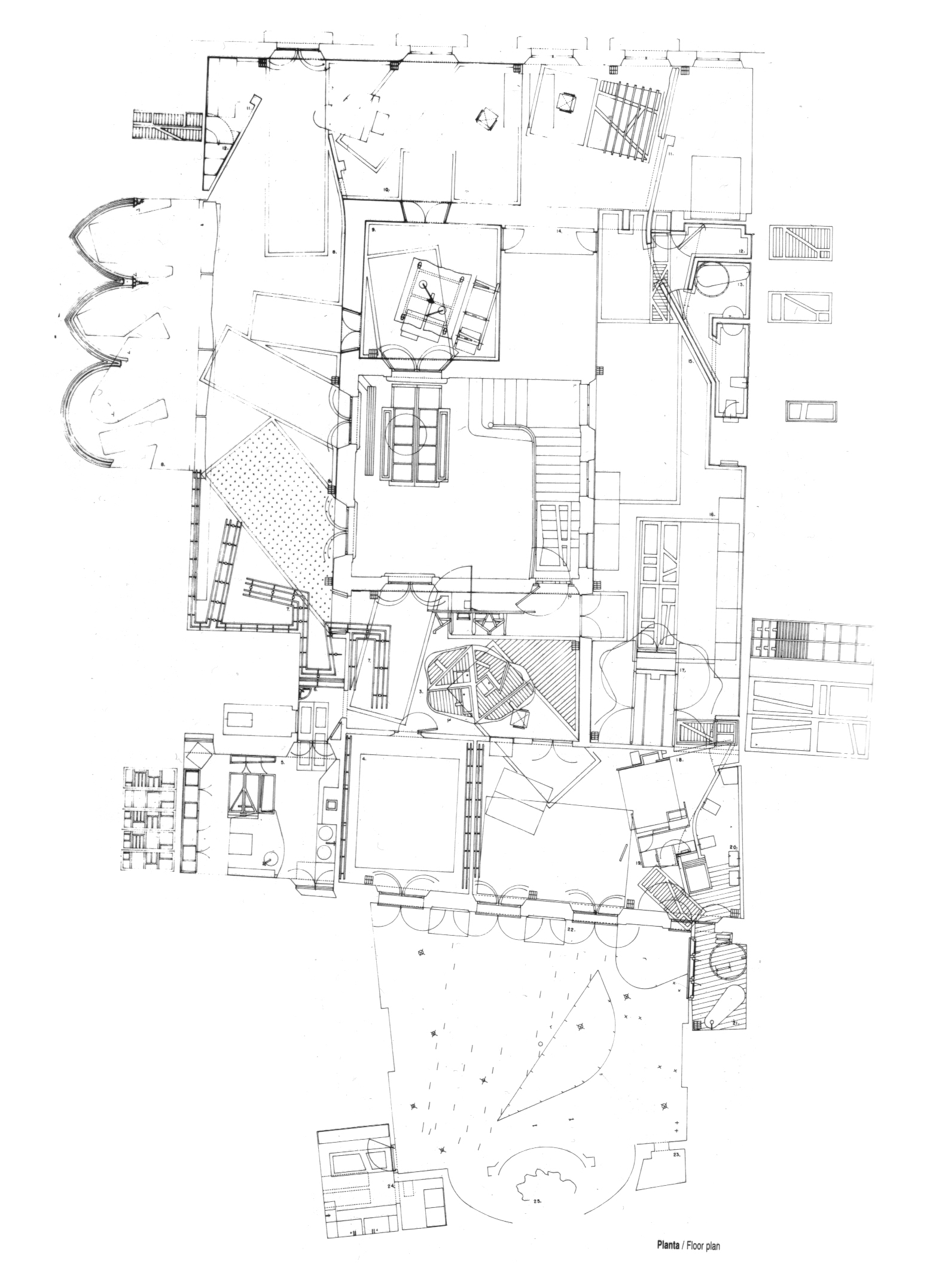
| Plan Drawings | |
|---|---|
| An architectural plan is subset of orthographic projection drawings wherein the projection plane is positioned parallel with the ground. In most plans, a 'cut plane' is positioned at a specified distance (typically 4') above an occupiable floor. Plans can reveal the interrelation between the interior spaces of a design, how an occupant is able to navigate these spaces, and the relationship between a building and its surrounding context. | |
| Part of | Drafting Board , Plotters and Printers |
| Part Type | Entity |
| Screenshot |

|
Plan Drawings
A special case of parallel projection , and more specifically a type of orthographic projection, a plan may be conceptualized as a horizontal cut through an object or building. Most aspects of an architectural plan drawing closely follow the conventions of orthographic projection, while others aspects (such as operable doors and cuts through stairs) are notational.
In most plans (with the notable exceptions of roof plans , site plans , and figure-ground plans ) a cut plane is positioned at a specified distance above an occupiable floor, typically at 4'. This cut plane determines how objects in the plan are represented: objects below this level are visible in the plan, objects at this level are shown as 'cut', and objects above this level are omitted or shown as dashed lines.
Common Types
Floor Plan
This is a drawing that you'll be using most of this term. A floor plan is a horizontal cut through a building, typically about 4 ft (1.2 m) above floor level. At this height, doors and windows are represented as being cut through. Typical scale: 1/8"=1' to 3/8"=1' However, if your drawing includes important features above the level of 4 ft (1.2 m), you should decide which level of cut describes your drawing in a better way.
Roof Plan
This is a horizontal cut above the building as a whole, looking onto the roof of the entire building. Shadows are often added to demonstrate the mass of the building in reference to the surrounding site. Typical scale: 1/16"=1' or smaller.
Reflected Ceiling Plan
This drawing is a horizontal cut through a building but instead of looking down, the view is looking up. This is typically used to indicated ceiling grids, lighting or material patterns. You will probably not be using this type of drawing much in school.
Partial Plan
A partial plan depicts a detailed portion of a larger design. Partial plans are typically set in relationship to a complete plan that is drawn at a smaller scale, or in relationship to an elevation or section that is drawn at the same scale.
Site Plan
This drawing is a horizontal cut through all the buildings and surrounding context. It can include the first floor plan or roof plan, depending on how you would like to emphasize the building on the site. Typical scale: 1"=50' or much smaller
Figure Ground Plan
Often called a Nolli Plan (after Giambattista Nolli's maps of Rome), these drawings are horizontal cuts through an entire neighborhood or city. Buildings are represented as black poche and non-building spaces are left white. This is a popular abstraction for understanding building or city patterns.
One of the basic tools urban designers use is a figure ground map. A figure ground diagram represents the relationship between built and unbuilt space wherein white represents unbuilt space while black represents the built space. A figure-ground diagram clearly illustrates the relationship between mass and void, and it is a powerful tool that can be used to study the urban fabric of a city.
A historical extension of this idea was utilized by Giambattista Nolli in his famous map of Rome in 1748. His map utilizes the same mass to void relationship utilized in the figure ground diagram; however, Nolli added an additional layer of information which included public spaces. Thus, when one views the Nolli map, not only is the void of street elements apparent against the mass of buildings, but the voids of public spaces such as churches are visible as well.
Figure-Ground Plan References
- Campus Plan Comparison
- A site by Ayers Saint Gross that pairs figure-ground plans of a large number of college campuses for comparison.
- Figure-Ground Game
- A game developed by sporcle.com that challenges the user to identify American cities by figure-ground drawings alone.
Conventions of Line Weight and Type
Lineweight, or the visual lightness or darkness and width of a line, are conventionally employed in plan drawings as follows: Line weight
Resources
Breaking Convention
Some notes by PATRICK WEBER on the Bartlett Year 1 Architecture Blog on Enric Miralles' Drawing for the Calle Mercaders Apartment:
The drawing lacks heirarchy. Miralles has no interest in establishing a clear heirarchical reading of the drawing. There is no variation in line weight (although occasionally, he doubles lines closely enough to approximate a thicker stroke). Mobile objects: tables, doors, etc. are not accorded any status distinct from stationary objects. The swings of doors and cupboards are not given a lighter line. Even the heirarchy of drawings is flattened: this drawing was not one of a set, and in it elevations are projected into the same plane, even the same paper space as the plan. Indoor-outdoor are not accorded any heirarchy: the drawing spills into outdoor spaces.
