|
Best Practices in 2d Drafting - Drawing Plans with Appropriate Detail and Scale |
|
|---|---|
| Screenshot | |
| This workflow will show the basics of creating an orthographic drawing using Rhino 2d, emphasizing the importance of layer organization, using proper lineweights and recognizing representational standards. | |
| Uses Tool(s) | Drafting Board , Rhinoceros , Illustrator CS5 |
There are a number of techniques that may be employed when drafting in 2D that will ensure clean, organized, and correct plan drawings. This drawing will emphasize working from an existing drawing or building where there is already an understanding of layout, wall thickness, material decisions and openings (glass, doors, etc). This could be working from a detailed hand drawing or from an existing drawing that is changing in scale (going from 1/4" to 1/8").
Steps
Setting up Construction Lines
this step is really only appropriate for orthogonal designs. imagine drawing the Vitra Fire Station using a grid of construction lines

When drafting by hand, setting up Construction lines are helpful for establishing your layout and establish an understanding of scale. These lines become reference lines for the entire drawing, often re-drawn later with a darker stroke. It's important to have some sort of construction lines set up so that the initial points in the drawing are able to snap to something rather than drawing from a blank canvas.
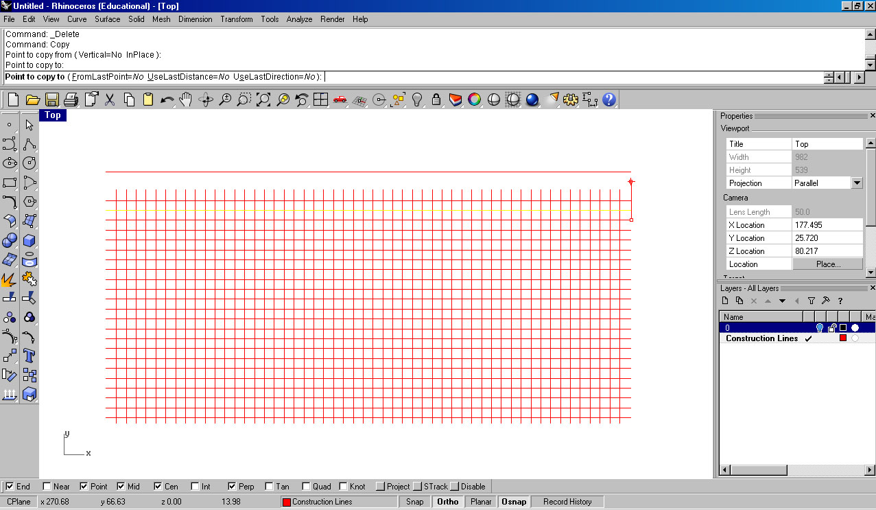
Similiarly, when drawing in Rhino, Construction lines can help orient your work and become reference points to snap to as you later draw walls, windows and doors. Rather than using the grid, set up your own grid that coordinates with the drawing you are creating. Create a new layer and titled it "Construction Lines" so that you can toggle it on and off later on. Draw a long line that would extend the length of your drawing (longer than the building) and copy it multiple times to form a grid.
When using the Copy command in Rhino, use the option "Select from Last Point" and "Use Last Distance" to quickly create evenly arrayed linework.
While many designs may not implement a grid, construction lines could also be useful in laying out the overall size of a drawing and the few prominent straight lines within the drawing (be that a column grid, stairs, paths or roads, or details such as the alignment of tables and chairs.)
Set up Layers
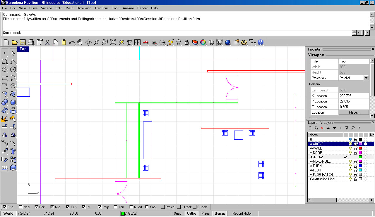
Layer organization is key for a good drawing, especially as the work becomes more detailed. Architecture offices are usually very particular about layer titles and maintenance. Check out this website for a listing of typical layers used in a drawing. Notice how many of the layers have the same display color, which organizes the lineweights when the drawing is plotted (for example, all magenta layers are used on detail layers and would probably be given a 0.125 pt linetype). For more information on line weights, see this Tool page .
To create new layers, simply select the new layer button in the layer tab of Rhino. You may chose to coordinate the layers with lineweights or object types to help quicken the process when you export the work to Illustrator.
Draw in Walls
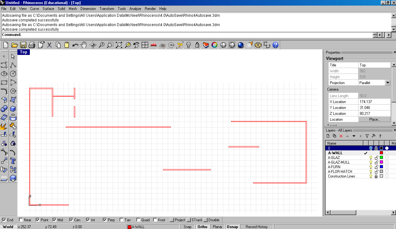
Start with the drawing with marking in the darkest lines that set up the foundation of the building : the walls. Ideally, you should be snapping to the construction lines you drew in the previous steps and entering in exact distances. Where walls are a uniform thickness, double-lines may be constructed using the Offset command. Where walls vary in thickness across their length or when joined with adjacent walls, each side of the wall should be independently drawn.
Important notes:
- Object Snap (OSnap) is a helpful tool that allows you to snap on precise points, but make sure you have the right settings. Having all the OSnap options on may lead to too many target points. End, Point, Mid, Int, Perp are all good snaps whereas NEAR and KNOT may cause some missteps in your drawing.
- Consider materiality when drawing! Exterior walls are typically thicker (0.5' +) whereas interior walls tend to be skinnier. In section drawings, floors tend to have a good thickness (2'+) to represent structural weight.
Tools: Line, Polyline, Offset, Fillet, Trim, Extend, Split, Divide
Draw in Details (Windows, stairs, columns)
This is the crucial step when working from a 3d model that is often skipped. Without including details, the plan or section can be overly diagrammatic. Details can help evoke scale and materiality.
Important details to add:
- Mullions to all glazing and glass walls
- Columns
- Stairs - note that the true stair convention is antithetical in plan to what appears when literally cutting the building. Diagonal cut lines are added along with arrows and dashes to represent the stair direction. Same goes with ramps.
Add Furniture (Using Blocks)
The addition of furniture and scaled figures (or trees, cars, etc) is often an effective way to denote program and scale within a drawing. It can also destroy the overall reading of a drawing by cluttering it up with the noise of undesigned and unconsidered elements. Make any "off the shelf" elements remain tertiary objects that compliment the design and the drawing, and avoid extraneous detail or distracting elements.
You may chose to draw your own custom furniture or work from existing blocks. If you choose the latter, check out the many free download sites online such as CAD Block Exchange Network or Cad Corner .
To add furniture and scale-element blocks to your drawing, refer to the full discussion of working with blocks in Rhino .
Tools: Block, BlockManager, Insert
Export to Illustrator
Illustrator should be used solely for presentation purposes. If the linework is already clean and the layers put together properly, there should be minimal time spent in Illustrator. This way, you can easily edit your work for the next pin-up.
Before exporting, it is good to select one layer at a time and join the lines. This way, fills can be added easily in Illustrator (rather than using Live Paint).
Select the linework you would like to export and move it to the origin (0,0,0). Export the linework at a specific scale by typing in the decimal in the export menu. OR - scale the drawing in Rhino before exporting to Illustrator, and then export as 1' = 1". Move the drawing back to its original location and save the file.
Here is more about Exporting from Rhino to Illustrator .
Tools: Join, Export, Scale
Adjust Lineweights
If all your layers are properly labeled and organized, you should be able to quickly change the linework. When opening the file, you may need to change the page setup so that all the work fits on one artboard.
Select all the work and change the stroke color to black. Walls, Columns and Section lines should have the thickest stroke, ranging from 1 to 2 pt. Glass and door details should be lighter, ranging around 0.5 to 0.75 pt. Furniture and floor patterns should have the lightest lineweight, 0.125 to 0.25.
It is important to understand the drawing conventions when putting together your plan or section, however it is also important to step back and make sure that it is reading spatially. Print often and pin up your work on the wall and ask a friend if they can understand the drawing. Levels of detail and lineweights can vary greatly from one drawing to the next.
Note:
- Lightest line that will show up on a plotter: 0.125 pt
- Darkest line that should show up on your drawing: 1.5 pt. Maybe 2 pt.
- Fill color (for section lines) should not be black. Too distracting and diagrammatic.
- Test print! Test print! Test print!
Common Problems
Resources
McNeel's explanation and walk through of using Blocks
Neufert, Ernst, Bousmaha Baiche, Peter Neufert, and Nicholas Walliman. Architects' Data. Oxford [u.a.: Blackwell Science, 2000. Print.
Pressman, Andy. Architectural Graphic Standards. Hoboken, NJ: John Wiley & Sons, 2007. Print.


