|
Section Perspectives From Digital Models |
|
|---|---|
| Screenshot | |
| This workflow will showcase the steps necessary to create a section perspective drawing using a digital model in Rhino. Once the linework is created, we will then export the drawing to Illustrator and finalize the drawing using a variety of fill, opacity and style options to create a presentable drawing. | |
| Uses Tool(s) | Rhinoceros , Illustrator CS5 |
A section perspective drawing can offer more spatial depth and understanding to a project than traditional orthographic drawings that are kept in the parallel view. With the advent of 3d modeling programs like Rhino, creating a section perspective drawing can be relatively simple but may require some additional clean-up or re-modeling. This workflow will go through how to set up a digital model to create the correct view and linework, how to render the model for shadows, and then how to post-process the linework and render in Illustrator to produce a finalized image.
The workflow includes both explanations for a
Rhino Render
version and a
VRay version
, which is usually just beneath the Rhino Render version. If rendering with VRay, the following files will allow you to follow along with the VRay steps:
Villa Savoye.zip
There are many different styles that could be incorporated once working in Illustrator. Be sure to consider your overall concept and design when deciding how to "stylize" your drawings. In this example, we will be using tools in Illustrator to create some spatial depth and context, similar in style to Lewis Tsurumaki Lewis .
Steps
Set up Model
Prior to doing this step, it is important to save an original copy of the model. Throughout this workflow we will be cutting, trimming and editing the digital model so the original model may be altered. Save a copy so that you can always return to it later on for additional drawings.
Prep the model by removing any construction linework or unnecessary elements that were used in the process of creating the model. For example, delete layers that are titled "Construction Lines" and delete any additional models or surfaces that are not part of the final model, such as floating surfaces or objects.
Section the Model
Once the digital model is ready, pick the location for the section cut. Similarly to making a traditional section drawing, pick a location in the model that emphasizes the conceptual and formal elements of the building.
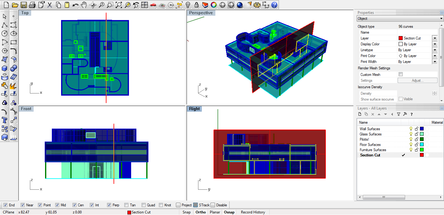
Working in a new layer for the section, use the CutPlane command to create the section cut plane. Make sure ORTHO is on. In the Top View, select the digital model as the objects for the cut plane, and then click on two points to create a section cut through the building. Once this plane is created, you can used Move it around to make sure it's in the exact location you would like.
Next, use the Section command to create the section lines. Complete this command in the TOP view to ensure that you are cutting a building section (not a plan). Select the entire building as the objects for section (but not the cut plane), and then click on two opposite ends of the cut plane for the start and end. Press enter to complete the command.
Place this linework on a layer called "section cut" and turn off that layer while we edit our model.
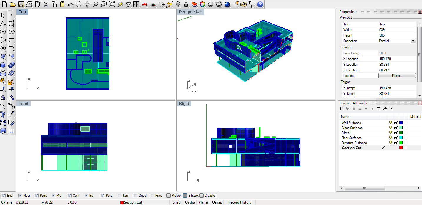
Then use the Split command to split the entire digital model along the cut plane. Select the entire building as the object to split and select the cut plane as the cutting object. This command may take awhile. Once the building is split, you should not delete the half you do not intend to render. Instead, group that half and save it to another layer. This layer can be used to view the shadows correctly later on if you are using VRay Render.
Select + Save the Proper View
At this point, you can view what the section of the building can look like by changing the viewport properties. Change the Display Mode to Ghosted or Shaded to better view the model.
In Right view, which has parallel projection, we can see what a typical section would start to look like. All of the walls perpendicular to the section are straight lines.If we move the view more to the side, but keep the projection on parallel, we can see what a section drawing looks like in an axonometric view. Notice how all the different sides in the building remain parallel to each other.
In Right view, if you change the projection to perspective , you can see what a one-point perspective section drawing looks like. You may have to zoom out a bit. The vanishing point is near the center of the building, giving automatic depth to each of the rooms inside the building.
Moving the camera further out, this section perspective emphasizes both the exterior of the building as well as the interior.
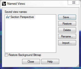
 Select a perspective view that sees into the space well. Save this view by right clicking on Viewport -> Set Views -> Named Views...
Make2d
To make the section cut poche easier in the final drawing, make sure to maintain source layers when you make 2D - so the section cut will remain easy to isolate.
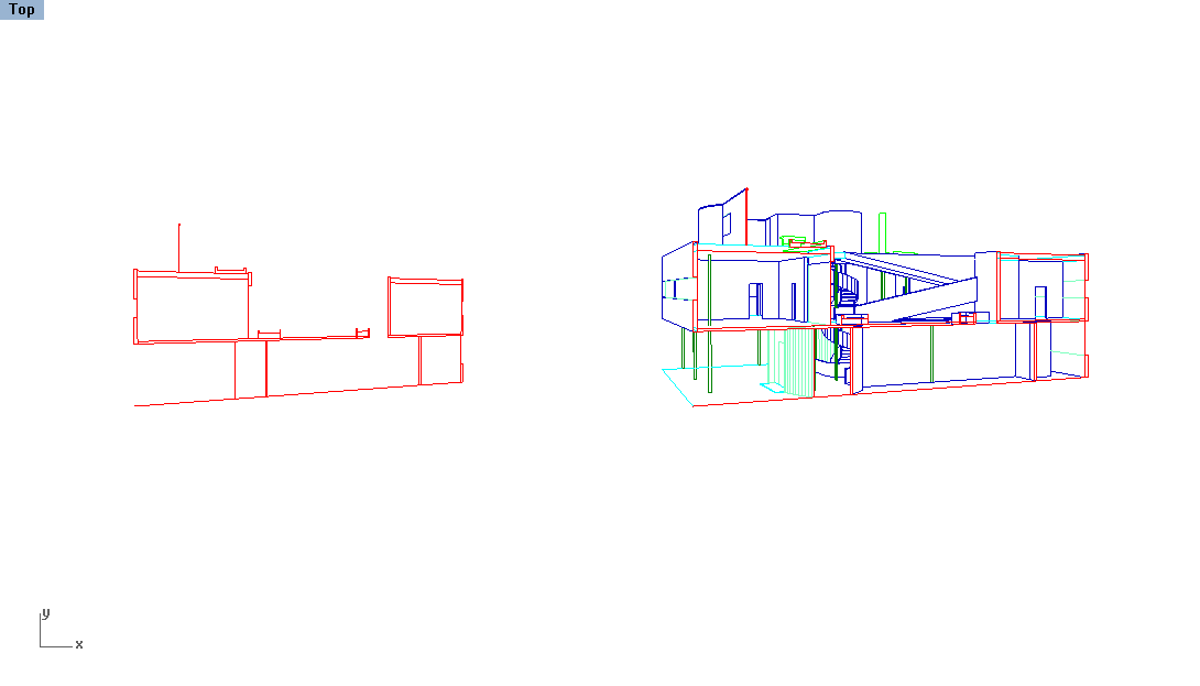
In the "Perspective Section" view turn on all the surface layers from the sectioned model. Select all the surfaces and your section cut linework and be sure to stay in saved view when using the Make2d command. Keep the "Maintain Source Layers" option on.
Clean-up Linework + Export to Illustrator
Just like in this Workflow, the process here is to clean up the linework so that it is presentable - fixing up bad corners, deleting unnecessary linework and re-attributing lines to layers that coordinate with lineweights.
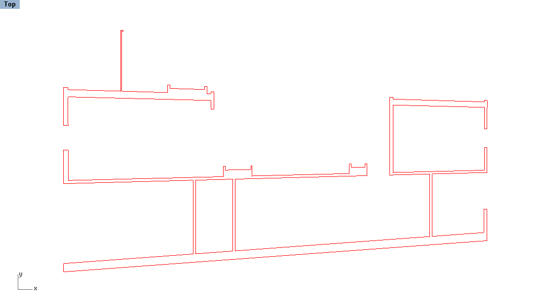
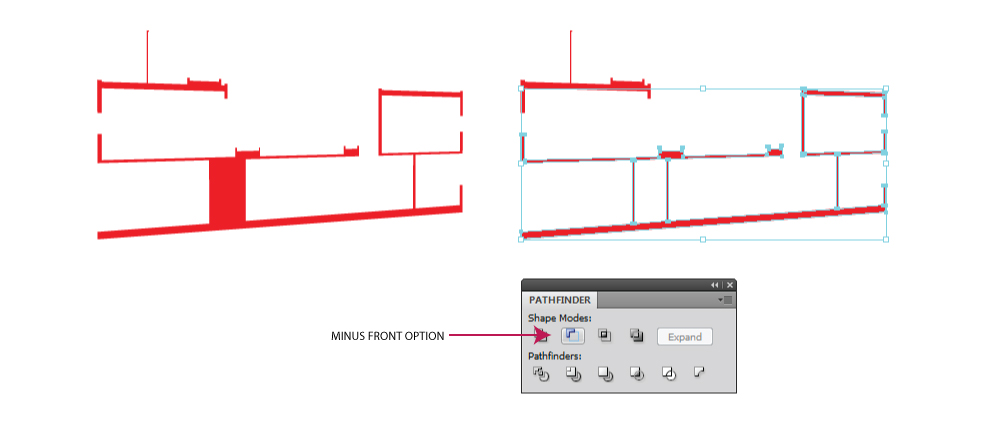
For the section linework, on the left, simplify the linework to just the poche and Join all the linework together. All of the linework should then become closed curves. This may mean deleting a lot of single lines so that the entire object can become a fill in Illustrator. You may also need to Scale according to the other Make2d linework so that it can fit easily when placing it on top of the final drawing in Illustrator. See the above image for an example. Save this linework in a new layer titled "Section Poche".
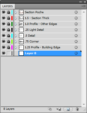
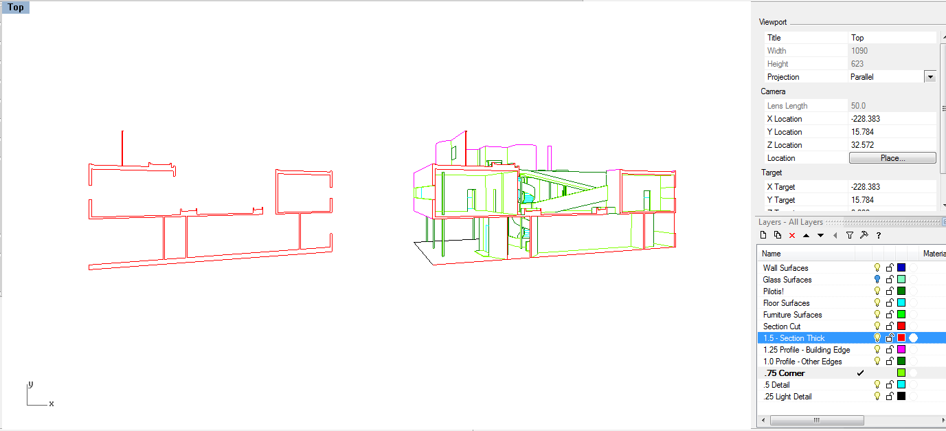 For the remainder of the linework, re-attribute the layers according to profile edges, corner surfaces or detail lines similar to a traditional axonometric or perspective drawing. In additional, linework that is "deep" in the drawing can become lighter to exaggerate depth.
When finished, select the two groups of linework and export to Illustrator. Note: there is no scale. Export at whatever size, as long as it will fit inside the Illustrator workspace.
Render Shadows
Before working on the linework in Illustrator, create a simple rendered image of the shadows using the same saved view and the Rhino Render.
First, turn off all transparent layers such as Glass to create shadows that better evoke the spatial qualities of the building. Second, create a surface that represents the ground receding into space. You can do this by creating a PlanarSrf or SrfPt that spreads all over the Top View. In this case, we can duplicated the ground floor using the Copy command and Scale it along the section line. Make sure the surface does not go beyond the section cut.
Add a Directional Light in the Right view, with the arrow pointing towards the building. Directional lights create parallel rays of light all pointing the same direction as this arrow - therefore the placement of the arrow is not important. To create good shadows in the section, have the arrow angled slightly so that some light can come into the building from the side and from the top. Use the Rotate command in the different viewports to create the proper angle you want.
Set up the Rhino Render by going to the Options menu. Change the options to include a Transparent background and 10x Anti-aliasing (which creates better, less jagged diagonal lines). You can increase the pixel size as long as it is proportional to the Viewport. Click OK to save.Render with RhinoRender
You can now Render and see what the shadows look like. Notice that the background is automatically black - this will be transparent in the saved file . You may have to go back and rotate around the Directional Light some more to tweak the view. Try to find the best angle that offers shadows into the space that help exemplify the relationship between vertical and horizontal surfaces, while also highlighting some of the strong formal qualities of the space (for this example, the central courtyard and ramp).
Save the final rendered image as a ".png" file so that the transparent background is preserved.
Render with VRay
If rendering with VRay, make sure your GI (skylight) is set to the directional light, and not Default. The unused geometry that was grouped during the split can now be used to view the correct shadows. Place it on a hidden VRay layer. For info on how to render with hidden geometry, check here . The glass can also be rendered with VRay by simply selecting "Import New Material" from the VRay material options and selecting the "clear_glass" material from the presets. If this does not sound familiar, check out VRay basics here and here . Everything else will be rendered with a simple off-white VRay material.
Vray Settings:
- Camera Tab - Physical Camera "on", Shutter speed "30.0"
- Environment Tab - GI (skylight) white, Reflection/refraction "Texsky" material
Clear Glass Settings
- Reflection Tab - Increase number for greater reflectivity
-
Diffuse Tab - Change color to light blue for slight hue, make transparency a darker grey for less transparency.
- Note: In Vray material settings 100% white = 100% transparent and 100% black = 100% opaque

The small changes made above are explained within the photoshop basics page,
here
. However, these changes are not necessary for the section perspective workflow.
When doing a large-sized render, you can use the waiting time to adjust lineweights in Illustrator and prepare any backgrounds. Use your time wisely!
Adjust Linework in Illustrator
Now open the saved linework file in Illustrator. Convert the different layers to their according linewights:
- Section = 1.5 pt
- Profile Edge (building) = 1.25 pt
- Profile Edge (others) = 1.0 pt
- Corner Lines = 0.75 pt
- Far Lines = 0.5 pt
- Details = 0.25 pt
For the section poche, in additional to adding a stroke, add a fill. The fill color could be gray or some bright color to emphasize the section cut. Use the Pathfinder tool to open up the areas where there is a box within a box. To do this, make sure all the interior "boxes" or curves are located on top by using the Arrange tool. Then, select all the linework and use the "MINUS FRONT" option in the Pathfinder tool.
You can now move the section linework to the same location as the other linework. Make sure the Section Poche layer is on the top of the other layers.
Add Shadows
Create a new layer in Illustrator that is underneath all of the linework layers. Lock the existing layers - these should not change in the remaining steps and stay as the forefront of the final image. The rest of the steps are to support this framework.
Place the rendered image of the shadows made in Step 6. This image will not be at the same scale as the linework, so re-scale the image using the Transform tool or moving the corners edges into place. Be sure to keep the proportion of the image - which should match the linework exactly. You can see how the ground plane we added in Step 6 also helps place the image into the site context with it's inherent horizon line.
Once in place, change the opacity settings in the Transparency tool. Decrease the opacity to 50% so that the shadows are not so extreme. Also change the layer properties to Overlay . This will effect the fills that we add in the next steps.
VRay Version:
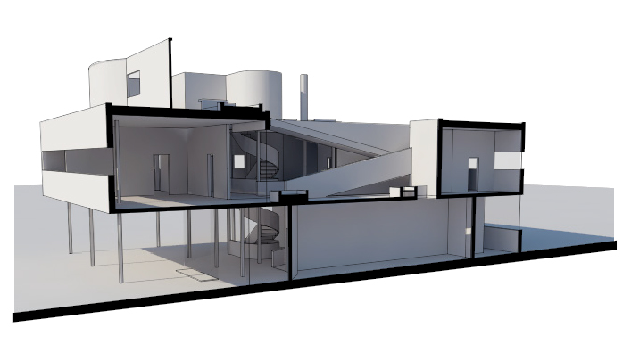
No need to adjust opacity for the Vray version, as shadows are rendered at the appropriate levels.
Add Fills
To emphasize certain materials, add fills that are placed into the drawing to call out different surfaces. Be sure to reduce all the opacities to create a watercolor effect.
Rhino Render:
Glass : Because the transparent surfaces were left out of the render, create fills in these areas to emphasize a clear, glass surface. Make sure all the existing layers are locked and create a new layer, below the Shadows layer as well. Using the pen tool, trace the outline of one of the windows. Make a closed polyline and add a blue fill with no stroke. Reduce the transparency to 50-80%. Continue this process for all the other window areas in the drawing.
 Exterior
: To emphasize a vertical surface, you can add a gradient to the fills created by tracing certain areas. Once the area is traced, open the
Gradient
toolbar and click on the Gradient slider. Now you should see a grayscale gradient appear. Edit the colors by clicking on the boxes. Make sure the darker edge of the gradient is on the far edge of the building. Further adjust the gradient by clicking and dragging on the image itself to replicate the gradient. Repeat this process for other vertical (interior or exterior elements) that you would like to call out.
VRay Render:
The glass was rendered in VRay, so it does not need to be accounted for in Illustrator.
Add Backdrop
To add ambiance, we can add a background image of the sky, city or forest behind the section drawing. Find an image online via google image search or websites such as 1000 Skies .
Rhino Render:
Create a new layer for the background, beneath all the existing layers. Before placing the image, trace the area that will make up the background using the Pen tool. This will be used as a Clipping Mask in the next step.
Once the outline is completed, paste or place the background image into the layer. Arrange this object behind the outlined background. Select both the image and the background outline and right click to select "Clipping Mask". The background image should then be framed by the outline you previously made. You can double click on the Clipping Mask to move around the image or edit it.
VRay Version:
The background will show up as transparent in the VRay render, allowing any image or sky to be easily placed behind it as a backdrop. Simply make a new layer, move it to the bottom and paster your backdrop into place. Feel free to arrange it to just the right position, which can leave only part of the image seen if it fits better than showing the whole thing.

Remember, the border of any rendering need not be rectangular or dictated by the images. You can use gradients to adjust how the background sky fits in the scene. The two gradients below go from white (100%) to white (0%), essentially disappearing at one end.
Add Scale Figures
Populate the image to further represent the program inside the different spaces.
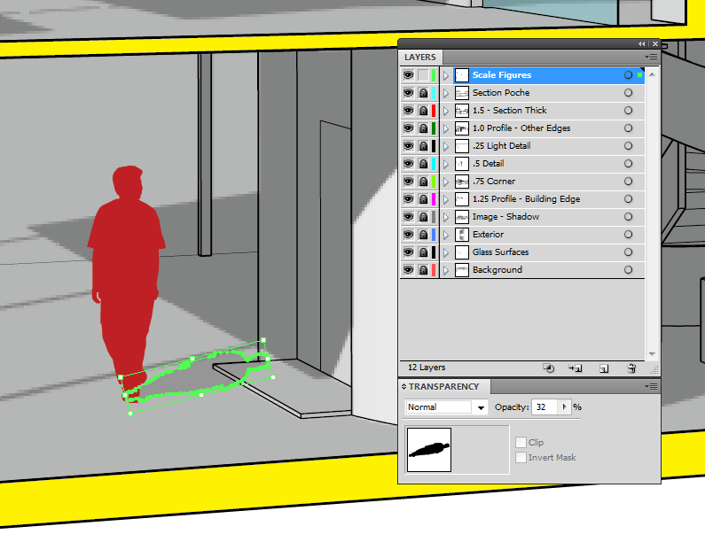
In a new layer, on top of the existing layers, paste vector silhouettes of people. Download this Illustrator file for a variety of silhouettes. Be sure to select silhouettes that match the program and style of the building.
Because this drawing is in perspective, identify parts of the building that have a specific scale when scaling the figure. For example, look for doors or windows. Use a fill that helps the people stand out, such as a solid gray or color.
To add shadows, copy the silhouette again and arrange it behind the original scaled figure. Rotate and scale the image so that it matches the shadows placed in Step 8. Decrease the opacity to match the tone of the shadows as well.
Vray Render:
Using the below zip file containing people, place them in the scene at the correct scale. Make sure that shadows are following those already in the scene, at a specific angle. Shadows should be made at 50% and the people should also be slightly translucent, at around 80%. Too much hard contrast with photos of people can begin to look flat and out of place.
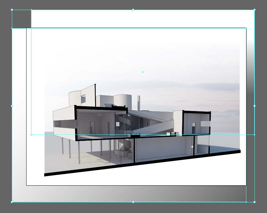
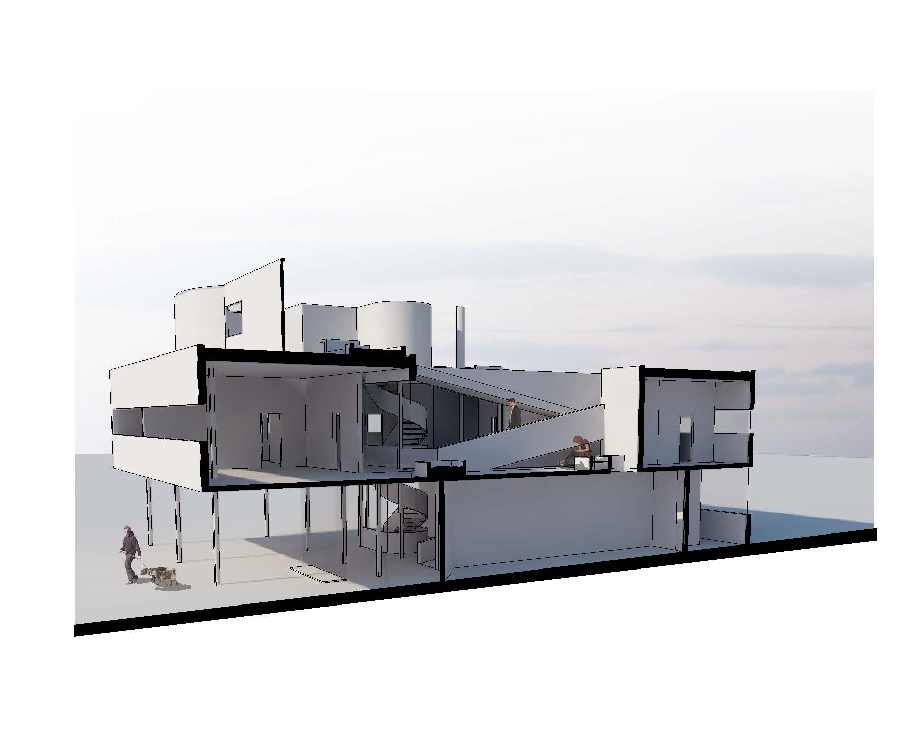
Once finished, your final render should come out looking something like this:
Additional Elements to Edit
- There are different ways to deal with the ground section. Some extend the section line all the way to the edge of the artboard, others keep it crisp to the building edge. Some make the whole bottom of the page (below the section drawing) part of the Section Poche. Go back to the Section Poche layer and edit to what you think looks best. For this example, I extended the section line and kept the bottom of the page white.
Common Problems
-
My Linework and Shadow Render aren't matching up!
- This is likely because you didn't return to your Saved view when creating new linework or rendered images. It is imperative to return to this saved view so that all of the linework and images are coming from the same exact view - especially when producing perspective drawings.
-
How do I know where the Horizon line is when adding background sky image or ground context?
- To do this, you must find the Vanishing Points for the drawing by tracing back where the two different axes converge. You can find where the axes converge by tracing back prominent building edges in the drawing. Another way to do this is to make a large ground plane like we did in the beginning of Step 6 (before rendering the shadows) so that we replicate the horizon in the image itself, by separating ground from sky.
Resources
- Digital Toolbox : Video tutorial goes over the first few steps in Rhino to produce a section perspective.
- This is Interesting Blog : Collection of Section Perspectives in this style


